Select Category


AI Summary
4 key insights · 1 expert tipThe best hall palettes for 2026 balance warmth, depth and visual calm. Two-tone walls, muted natural colours and carefully planned ceiling shades can make living rooms feel more considered without relying on loud contrasts.
KEY INSIGHTS
- Warm neutrals and earthy tones create a flexible base for Indian living rooms.
- A two-tone palette works best when one colour leads and the second adds depth.
- Ceiling colours should support the wall palette without visually lowering the room.
- Compact halls benefit from high light-reflecting surfaces, lower contrast and restrained accent walls.
 DESIGNCAFE EXPERT TIP
By our design team
Shiva Bisht, Interior Designer at DesignCafe, Bangalore, advises, “Study where daylight enters the room before choosing a colour. A shade that feels calm beside a large window may appear much denser on a shaded wall. Test the deeper colour on the exact wall where you plan to use it and observe it at different times of the day.”
Discover hall colour combinations that balance natural light, room size and everyday style.
The best colour for hall interiors in 2026 is less about picking one fashionable shade and more about creating balance across walls, furniture, light and the ceiling. Indian living rooms often carry several roles, from everyday lounging to hosting guests. The colour scheme needs to hold it all together without making the room feel busy.
Warm neutrals remain useful foundations, while muted greens, earthy browns, gentle blues and deeper accent colours are bringing more character into living spaces. The strongest combinations work with the room’s daylight, proportion and existing finishes rather than fighting them.

How To Choose The Best Colour For Your Hall?
Choosing the best colour for hall walls starts with the room rather than the shade card.
Look first at daylight. A hall with strong afternoon sun can carry cooler greys, dusty greens and soft blues. A room with limited daylight often feels more welcoming in warm beige, cream, muted peach or ivory.
The next decision is proportion. A large uninterrupted wall can carry a deeper hall wall paint colour, while narrow walls are usually better kept lighter so the room does not feel fragmented.
Furniture matters too. Walnut furniture, beige upholstery and brass details sit naturally beside warm neutrals. Grey sofas and black metal details can take cooler beige, sage or muted blue.
The finish changes the effect as much as the colour. Low-sheen paint keeps glare controlled and lets artwork, joinery and fabrics take visual priority.
For a balanced hall colour design, work with a simple hierarchy:
- Let one main colour cover most walls.
- Use a second shade on an accent wall or architectural feature.
- Repeat small traces of that colour through cushions, art or soft furnishings.
- Keep flooring and major storage finishes in the same warm or cool family.
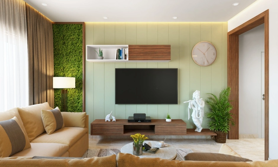
Layered Two-Tone Ideas For A Hall Wall Colour Combination
A hall wall colour combination feels most resolved when the two colours have different jobs. One creates continuity. The other introduces rhythm or depth.
1. Warm Ivory With Olive For A Two-Colour Combination For Hall
Warm ivory reflects light and keeps the room open. Muted olive adds enough colour to ground the scheme.
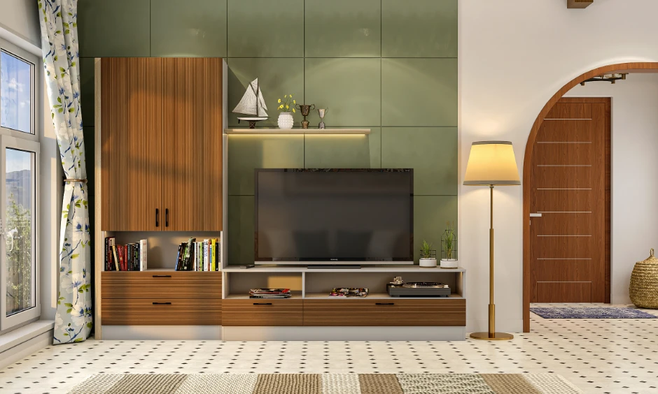
Use olive behind the television unit, sofa or a shallow display niche. Keep adjacent walls ivory so the darker surface reads as a deliberate focal plane rather than an enclosed box.
Wood-finish storage and warm-white lighting sit comfortably with this palette.
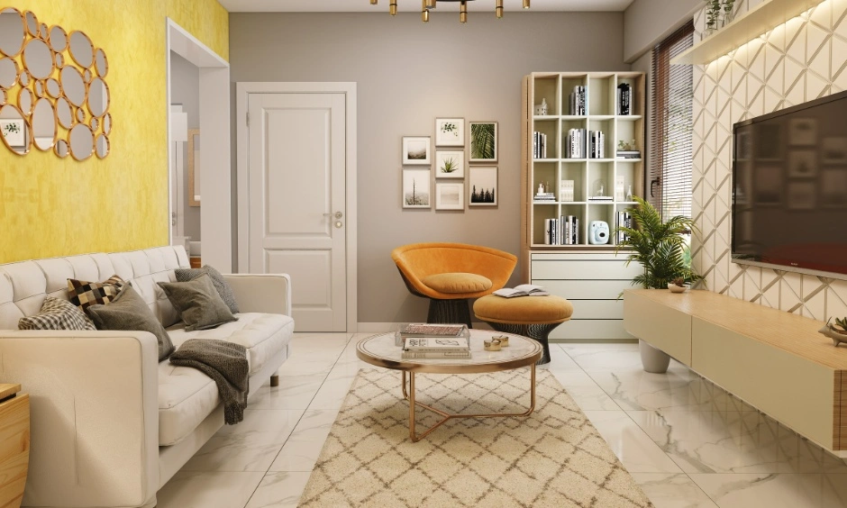
2. Greige With Dusty Blue For A Modern Hall Colour Combination
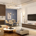
Greige is useful where beige feels too yellow and grey feels too cool. Pairing it with dusty blue creates a restrained modern hall colour combination suited to contemporary apartments.
The blue works best on a wall that receives balanced daylight. Under weak artificial light, very grey blues can look flat, so warmer lamps and timber furniture help restore depth.
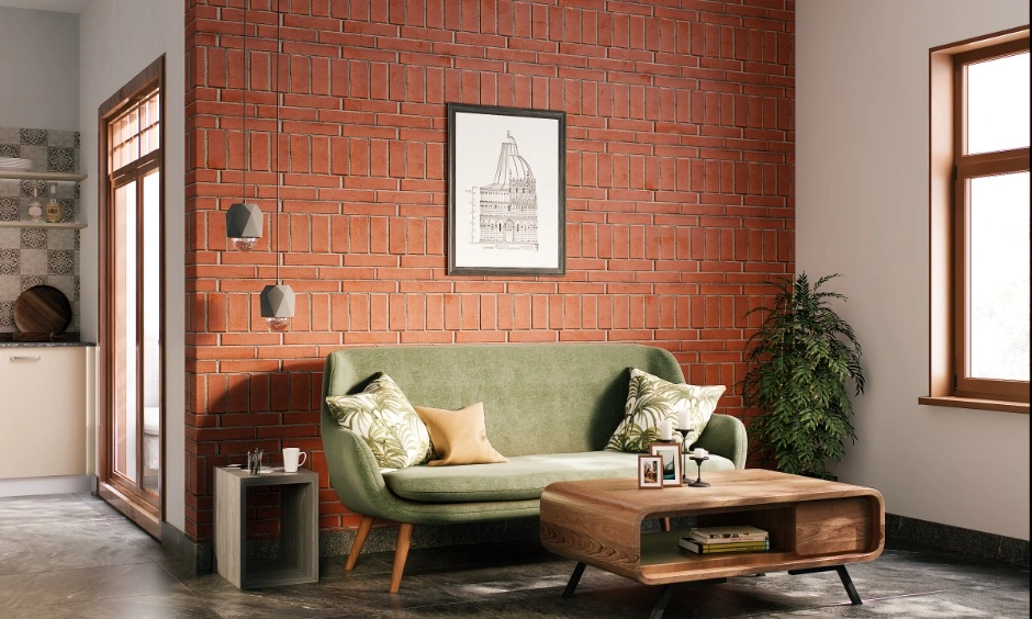
3. Cream With Terracotta For A Cream Colour Combination For Hall
A cream colour combination for hall walls can take on more character when terracotta is used sparingly.
Cream keeps the larger surfaces bright. Terracotta can frame an alcove, dining transition or feature wall. Its earthy warmth works particularly well with cane, timber, textured fabrics and warm stone-look flooring.
This is a useful hall room colour combination when the living and dining zones share one open plan but still need gentle visual separation.
4. Deep Tones For A Royal Colour Combination For Hall Interiors
A royal colour combination for hall design doesn’t require every wall to be dark.
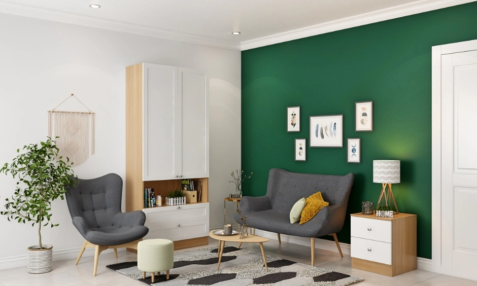
Deep colours feel more refined when they are given space. Forest green, burgundy, midnight blue or aubergine can create richness against warm ivory, mushroom beige or muted stone.
Consider midnight blue behind a light sofa with walnut furniture. Forest green works well beside cream upholstery and brushed brass details. Burgundy is stronger, so it is better contained to a smaller wall or panelled section.
Surface finish is crucial here. A matte or low-sheen dark wall absorbs more light and feels quieter. Dark matte finishes in high-traffic Indian halls can show scuffs or fingerprint marks easily. Glossy paint can make a saturated colour look harsher, particularly under multiple ceiling lights.
For a richer wall paint colour combination for hall interiors, let fabric and texture carry part of the depth. Velvet cushions, woven curtains, fluted wood or a textured rug can make a restrained palette feel layered without adding another wall colour.
Calm, Simple Indian Hall Colour Combination Ideas
A simple Indian hall colour combination should sit comfortably beside everyday materials already found in the home.
Warm off-white with teak is a dependable pairing. Beige with muted green feels softer and more natural. Pale peach with ivory adds warmth without turning sugary. Sand and brown work well where the room already contains darker wood furniture.
These palettes suit Indian living rooms because they allow furniture, artwork, prayer corners, display pieces and festive decor to change without requiring the whole room to be repainted.
For a practical colour combination for hall interiors, avoid treating every wall as an opportunity for contrast. Repetition creates calm. A single base shade across adjoining walls often makes storage units and furniture feel more integrated.
Tiles need similar attention. The tiles colour for hall flooring should usually support the wall rather than compete with it. Warm beige tiles work with ivory, olive and terracotta. Cooler grey flooring is easier to pair with greige, blue and muted sage.
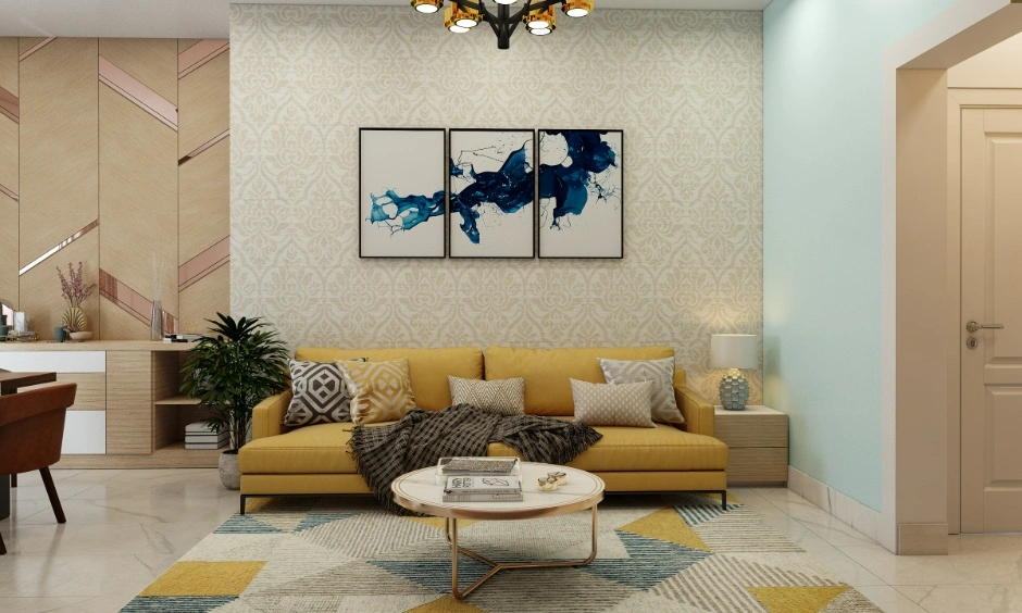
Pop And Ceiling Colour Combinations That Keep The Room Balanced
The ceiling is one of the largest visible planes in a living room, yet it often gets treated as an afterthought.
A considered hall POP design colour can make the ceiling feel part of the architecture rather than decoration added later.
1. Soft White With Beige Walls For A Ceiling Colour Combination For Hall
A soft white ceiling paired with beige or greige walls keeps the ceiling visually high. This is particularly useful in apartments where a false ceiling has already reduced the room height.
Avoid a stark blue-white ceiling above a very warm wall. The temperature difference can make both surfaces feel disconnected.
2. Tonal Neutrals For Hall Ceiling Colour Design
A subtle hall ceiling colour design can use a pale version of the wall shade inside recessed borders or ceiling details.
For example, warm ivory walls can meet a slightly lighter cream ceiling. Greige walls can move into a pale stone overhead.
The difference should be slight. Strong ceiling contrast draws the eye upwards and can make a compact room feel busier.
3. Accent Colour Inside POP Details
A POP colour combination for hall ceilings can include one restrained accent inside a recessed band or central detail. Repeat a colour already present on the walls rather than introducing a completely new shade overhead.
If cove lighting forms part of the ceiling, it can sit within a shallow recess and wash the surface with indirect light. Warm illumination generally supports beige, cream and earthy shades, while very cool lighting can make them look washed out.
The wall and ceiling should always be read together. A dark hall wall colour beneath an equally deep ceiling can visually compress the room unless the hall is large and naturally bright.
Design Your Dream Living Room with These Trending Ideas


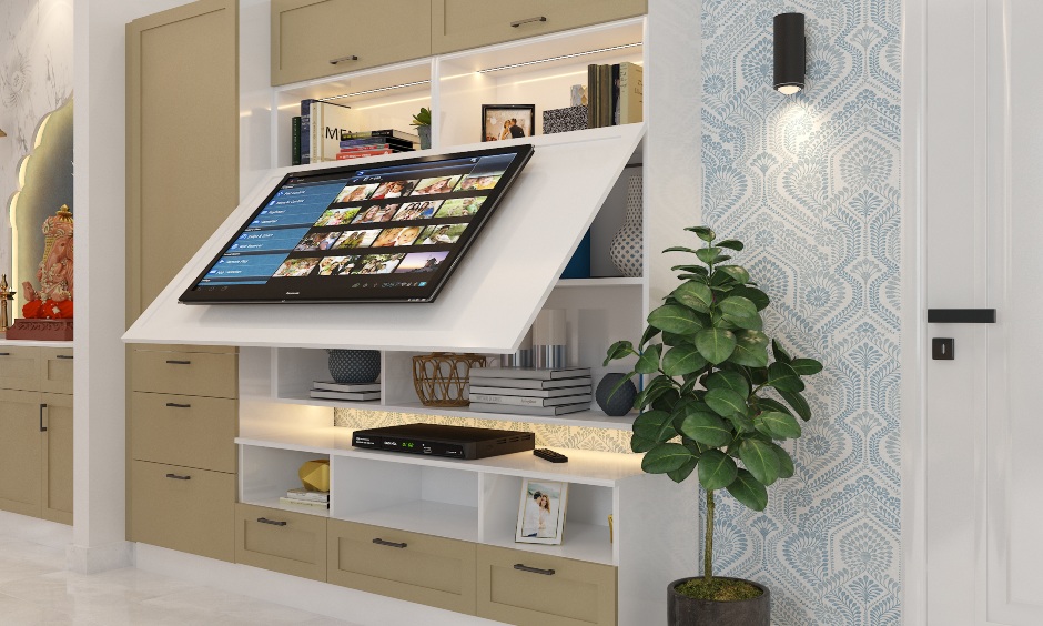
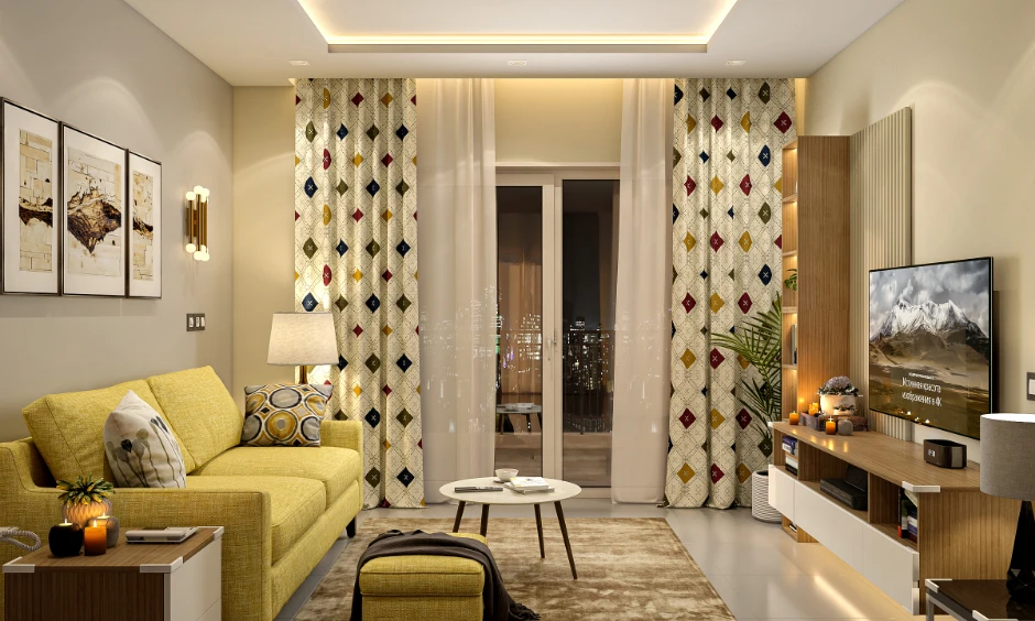
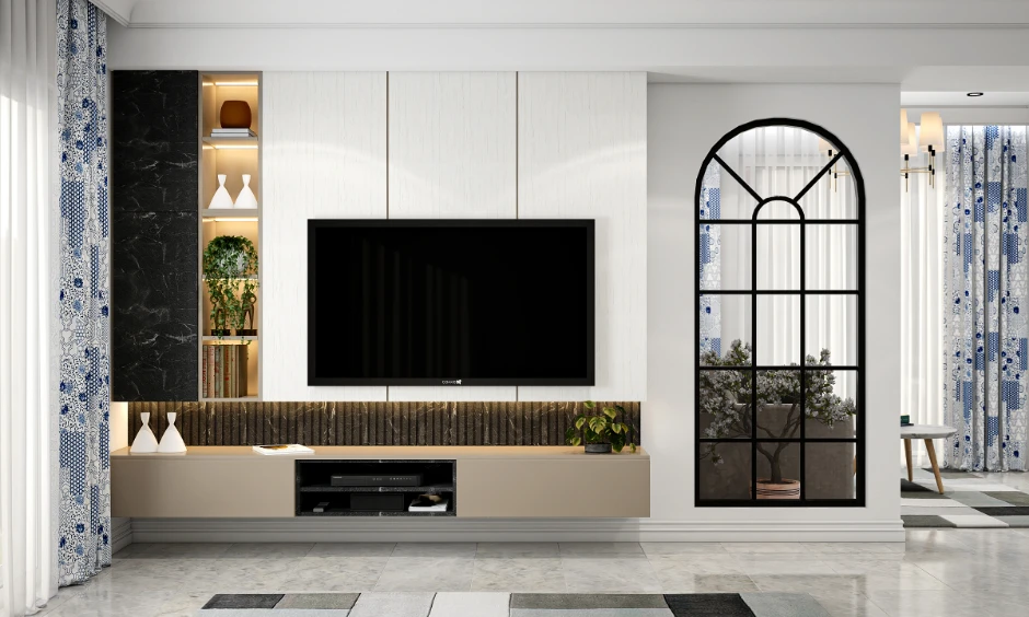
Vastu Colours For The Hall Without Losing The Design Story
Vastu colour for hall interiors is easier to work with when you consider direction and aesthetics together rather than as separate decisions.
Common Vastu-led preferences often favour light, calm shades such as cream, white, pale yellow, soft green and gentle blue. The exact choice depends on the orientation of the room and the wider home plan.
From a design perspective, these colours are flexible because they already work well as large background surfaces.
A pale green wall, for instance, can be paired with warm timber to keep the room from feeling cool. Cream can gain depth through beige textiles, wood grain and subtle brass details.
For homeowners considering hall colour as per Vastu, use the recommended colour as the dominant base and bring stronger personal choices through furniture, artwork or a controlled accent plane. This keeps the Vastu intent intact without making the living room feel formulaic.
Small-Hall Colour Tricks That Improve Light Reflection
A small hall colour combination works best when large surfaces flow into one another.
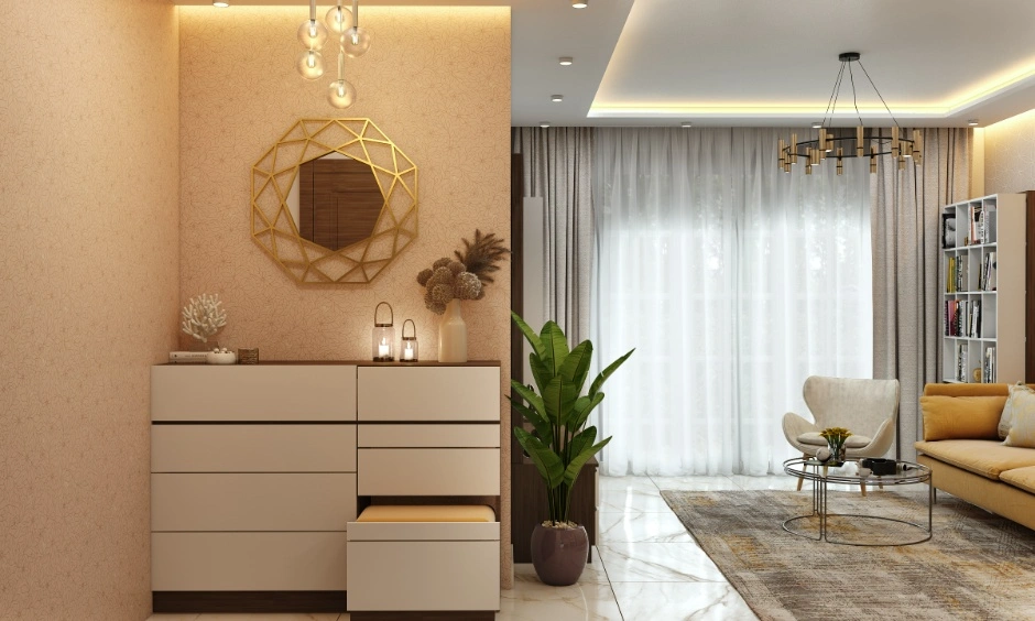
Pale beige, warm white, light greige and soft sage reflect more daylight than very saturated colours. Keeping walls and large storage units close in tone reduces visual breaks and makes the room feel wider.
This does not mean every small hall needs to be white.
A deeper shade can still work on one short wall. Place it where it creates depth rather than narrowing the main line of sight. The wall behind a television unit or compact sofa is often more useful than colouring both long side walls.
The light-reflection rule is simple. The darker the room, the more important it becomes to keep the largest surfaces light.
Mirrors can amplify this effect, but placement matters. A mirror opposite or beside a window can spread daylight further into the room. Random mirror panels on every wall tend to create visual noise instead.
Keep the hall paint colour combination close in value where the ceiling is low. High contrast between dark walls, white ceiling bands and patterned flooring can divide an already compact room into too many layers.

Ten Designcafe Colour Picks For 2026
For homeowners comparing options, these ten combinations offer a useful starting point:
1. Warm ivory and muted olive for an earthy, relaxed living room.
2. Greige and dusty blue for cooler contemporary interiors.
3. Cream and terracotta for warmth with a crafted Indian character.
4. Mushroom beige and forest green for controlled richness.
5. Soft white and walnut brown for a timeless timber-led scheme.
6. Sand and muted rust for an understated warm palette.
7. Pale sage and ivory for bright halls with plenty of daylight.
8. Stone grey and warm white for clean apartment interiors.
9. Deep blue and cream for a refined, high-contrast feature wall.
10. Muted peach and beige for a gentle warm scheme without excessive sweetness.
Treat these as starting palettes rather than rigid recipes. The final hall wall colour combination for living room spaces should respond to daylight, ceiling height, floor finish, upholstery and the amount of visible storage.
How DesignCafe Colours Your Home?
Colour planning at DesignCafe begins with the room as a whole.
The wall shade is considered alongside furniture placement, flooring, storage, ceiling design and lighting. This prevents a colour from looking convincing on a sample card but disconnected once the complete room comes together.
A compact living room might need lighter wall planes around a full-height television unit. A larger hall can carry a deeper accent wall because there is enough visual distance to appreciate it.
Internal links can sit naturally around related decisions such as living room interior design, false ceiling designs for living rooms, living room wall design, space-saving living room furniture and Vastu colours for the home.
This whole-room approach matters because the best colour for hall interiors is rarely decided by paint alone. Light, material and proportion decide how that colour is finally experienced.
Conclusion
The best colour for hall interiors is the one that makes light, furniture and surfaces feel connected. In 2026, the most convincing palettes are moving away from loud contrast and towards warmer neutrals, natural greens, earthy accents and carefully placed deeper tones.
Look at the wall and ceiling together. Notice where daylight falls. Let one colour lead and give the stronger shade a clear purpose. That restraint is often what makes a living room feel considered rather than decorated.
Begin a brief with us, and let a DesignCafe designer shape a home that feels personal, proportioned and quietly composed.
FAQs
1. What is the best colour combination for a hall?
Warm neutrals paired with muted green, blue, terracotta or brown are versatile choices. The best combination depends on daylight, flooring, furniture and room size.
2. What two colours go well together in a hall?
Ivory and olive, greige and dusty blue, or cream and terracotta make balanced two-tone combinations. Keep one shade dominant and use the second as an accent.
3. Which colour is best for a hall as per Vastu?
Light shades such as cream, pale yellow, soft green and gentle blue are commonly considered. The best choice can vary depending on the room’s direction and the overall Vastu plan.
4. What colour makes a small hall look bigger?
Warm white, pale beige, soft greige and other light-reflecting colours help large wall surfaces feel more open. Lower contrast between walls and ceiling can improve the effect.
5. What is a good royal colour combination for a hall?
Deep blue with cream, forest green with warm beige or burgundy with soft ivory can create richness. Restrict the darker shade to a controlled wall or feature so the room keeps its visual balance.