Select Category


AI Summary
5 key insights · 1 expert tipColour shapes how a room looks and feels. The right palette can make a space feel warm, bright, or inviting, while the wrong one can leave it dull or unbalanced. This guide explains how to choose colours based on a room's purpose, natural light, and design.
KEY INSIGHTS
- What colour terms like theme, scheme, and palette actually mean
- How colour changes a room’s feel without touching the furniture
- The 60-30-10 rule that interior designers use to balance any palette
- Room-by-room interior paint colour ideas for Indian homes
- Common mistakes that make interiors look disconnected
 DESIGNCAFE EXPERT TIP
By our design team
DESIGNCAFE EXPERT TIP
By our design team
Priyanka Pudipeddi, Studio Manager, DesignCafe, Vizag, suggests, "Most homeowners choose interior wall colours before deciding on furniture finishes. Do it the other way around. Your floor is the largest fixed surface in the room. Every colour decision should start there."
Pick the wrong home interior colour, and no furniture fix will save you.
Endless discussions, countless catalogues, multiple visits, suggestions from everyone around you, and hours spent browsing – sounds like you are planning your child’s higher education, right? Not quite. We are talking about choosing the perfect home interior colours.
But why is it such a big decision? Because it’s where you’ll spend your everyday moments, celebrate milestones, and create memories with the people you love. Naturally, you want every room to feel just right. That’s where this guide comes in.
Why Home Interior Colour Is The Foundation Of Great Interior Design?
Colour does three jobs at once. Here’s how:
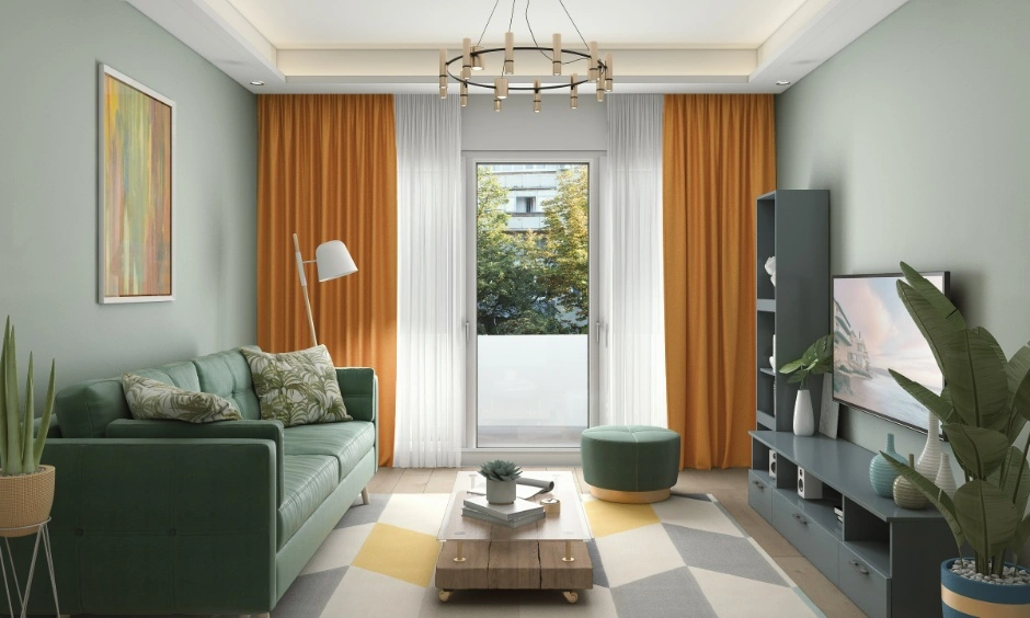
- Mood: Warm tones feel relaxed and inviting. Cool tones help you focus or unwind.
- Space perception: Light interior colour shades push walls back. Dark ones pull them in.
- Style expression: Good interior colours tell a story about who lives there.
- Cohesion: A shared undertone across rooms is what makes a home feel complete, not piecemeal.
Interior Paint Colours Terms Every Homeowner Should Know
1. What Is A Colour Theme?
A colour theme is the overall mood or direction for your home’s interior house colours. Think: warm and earthy, or cool and minimal.
2. What Is A Colour Scheme?
A colour scheme is the specific combination of room interior colours you use together, following a logic like complementary or analogous pairings.
3. What Is A Colour Palette?
Your palette is the actual set of shades selected, from your dominant interior wall colours to your accent cushion. It’s your colour shopping list.
4. What Is A Colour Tone?
Tone refers to how light or dark a shade reads, separate from the colour family itself.
5. Theme vs Scheme vs Palette: What’s The Difference?
| Term | What It Means | Example |
| Theme | Overall mood or direction | Warm and natural |
| Scheme | A combination of colours that work together | Complementary |
| Palette | The actual shades selected | Terracotta + cream + forest green |
| Tone | Light/dark value of a shade | Light sage vs deep sage |
Understanding The Fundamentals Of Interior Wall Colours
The Colour Wheel Explained
The colour wheel helps you understand which colours look good together. Adjacent colours harmonise; opposite colours create contrast.
Warm, Cool, And Neutral Colours
Warm interior colours (reds, yellows, oranges) feel energising. Cool interior colours (blues, white, greens) feel calm. Neutrals sit between and work with both.
Hue, Saturation, And Value
Think of it this way:
1. Hue is the basic colour, like blue or green.
2. Saturation is how bright or muted the colour looks.
3. Value is how light or dark it appears on your walls.
How Do Colour Relationships Work?
Two colours placed side by side shift how each looks. A warm beige next to grey feels creamier. Next to white, that same beige looks yellowish.
Trending 3 BHK Interior Designs


Understanding The Building Blocks Of Best Living Room Colours
Value: Light vs Dark Colours
Light colours reflect more light, making a room feel bigger and brighter. For example, a small bedroom painted in off-white feels more spacious than the same room painted in charcoal grey. Dark colours, on the other hand, create a cosy, cocoon-like feel.
Saturation: Bold vs Muted Colours
Bold colours grab attention and add personality. A mustard yellow accent wall can make your living room feel vibrant, while a muted sage green creates a calmer, more timeless look that’s easier to live with every day.
Temperature: Warm vs Cool Colours
Warm colours like cream, beige, and terracotta make a room feel welcoming. Cool colours like blue, green, and grey feel fresh and relaxing.
Undertones: The Hidden Colours That Matter
Every ‘white’ or ‘grey’ carries an undertone, pink, yellow, or blue. If your walls have a warm white and your tiles a cool grey, the room can look mismatched even though both colours seem neutral.
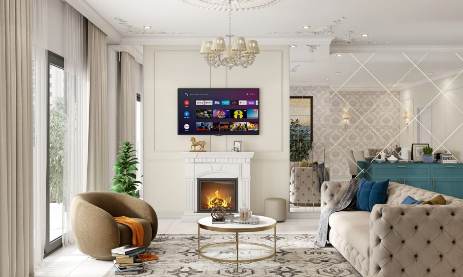
How Do Latest Home Interior Colours Influence The Feel Of A Space?
| Goal | Colours To Choose | How They Help |
| Make small rooms feel larger | Light, cool colours like soft white or pale sage | Reflect more light, making walls appear farther apart, and the room feel more spacious. |
| Create warmth and comfort | Earthy shades like terracotta or warm beige | Make the space feel cosy and welcoming. |
| Encourage focus and productivity | Muted greens and soft blues | Create a calm environment that helps you concentrate without feeling dull. |
| Build a calm and relaxing environment | Dusty rose, warm grey, or other muted shades | Reduce visual contrast, to help the room feel restful and uncluttered. |
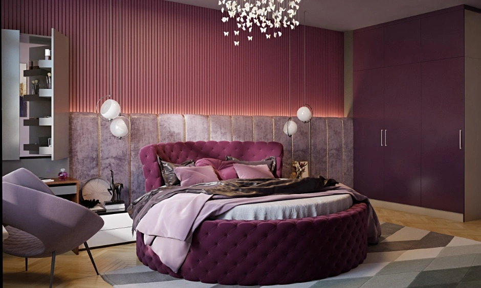
| Add drama and luxury | Deep teal or plum with warm neutrals | Create a rich, luxurious look without expensive materials. |
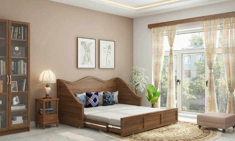
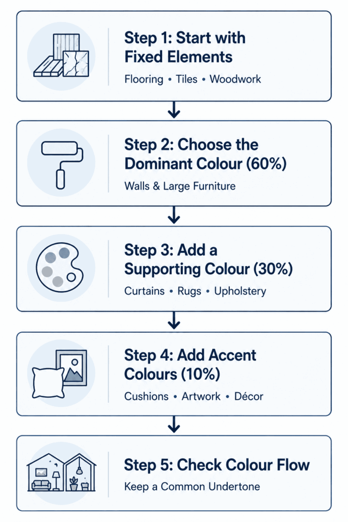
How Do Designers Build An Interior Wall Paint Colours Palette?
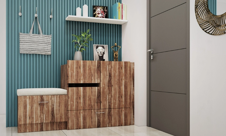
Popular Room Interior Colour Palette Approaches Used In Modern Homes
1. Monochromatic Palettes: One colour, multiple tones. Mixing textures keeps the space interesting. Without them, it can feel flat.
2. Analogous Colour Schemes: Adjacent colours on the wheel pair up subtly. Sage, olive, and forest green feel cohesive without being matchy. Good for nature-inspired home interior colour ideas.
3. Complementary Colour Schemes: Opposite colours on the wheel create high contrast. Navy and terracotta is a classic, popular home interior colour pairing for good reason.
4. Neutral-Led Palettes: It is the most forgiving approach for Indian homes. Off-white, warm beige, and greige look beautiful under all lighting conditions.
5. Earth-Toned Palettes: Terracotta, warm brown, moss green. These new home interior colours age well and pair naturally with Indian wooden furniture and jute textures.
6. High-Contrast Modern Palettes: Black, white, and one bold accent colour. Works best when natural light is generous and the floor plan is clean.
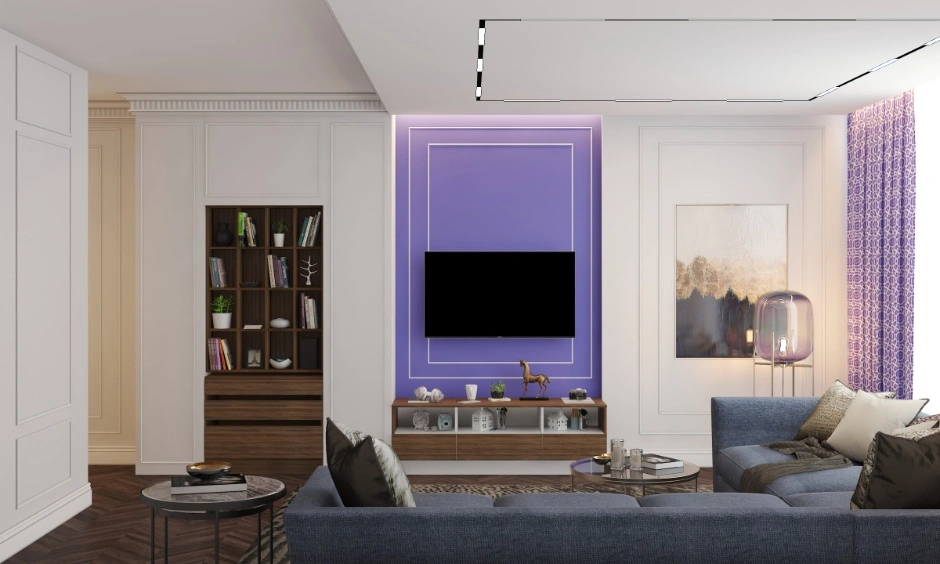
The 60-30-10 Rule of Home Interior Colour Explained
The formula is simple: 60% dominant colour, 30% secondary colour, 10% accent colour.
This can be reproduced through various elements. Your walls and large furniture carry the 60. Your rugs, curtains, or a secondary sofa carry the 30. Cushions, artwork, and decor accessories carry the 10. Interior designers use this ratio to keep any interior colour combination balanced.
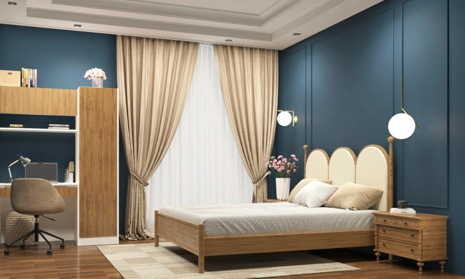
Choosing Interior House Paint Colours For Different Interior Styles
| Interior Style | Best Interior Colours For Home | What To Avoid |
| Contemporary | Warm whites, muted grey tones | Too many competing accents |
| Japandi | Sage, warm white, charcoal | Bright or heavily saturated shades |
| Traditional Indian | Terracotta, ochre, warm wood tones | Cold greys or stark pure whites |
| Scandinavian | White, light grey, blush | Heavy or dark accent colours |
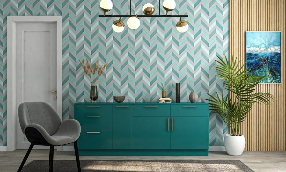
Applying Home Interior Colour Across Different Elements Of A Home
Choosing the right colours is only half the job. Where you use them matters just as much. Applying colour consistently across walls, ceilings, furniture, and decor creates a balanced look, while using too many colours or placing them randomly can make a room feel cluttered.
| Area | How To Use Colour |
| Walls | Use your dominant colour. Keep it consistent across connected spaces for a seamless look. |
| Ceilings | Choose a shade one step lighter than the walls to make the room feel taller. |
| Trim and Doors | Use white or a contrasting shade to define the room’s architectural details. |
| Furniture | Introduce your secondary colour through sofas, chairs, or cabinets. |
| Accessories | Use accent colours in cushions, artwork, and décor. Limit them to two shades to avoid visual clutter. |
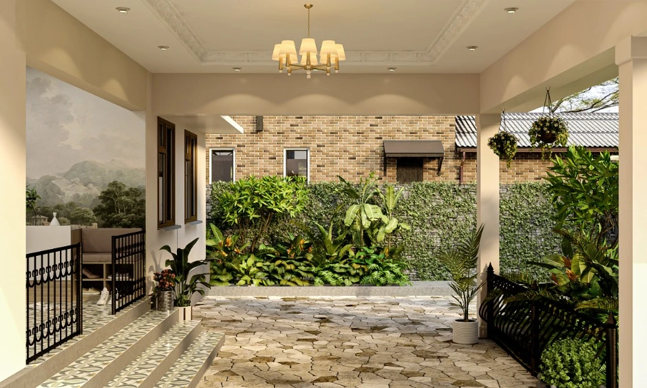
Room-by-Room Interior House Colour Planning
Each room has a different purpose, so the right colour choice varies accordingly. Here’s a simple room-by-room guide to what works best and what to avoid.
| Room | Recommended Shades | Purpose | Avoid |
| Living Room | Warm neutrals, earthy greens | Create a warm and welcoming space for family and guests. | More than 3 accent colours |
| Bedroom | Dusty pastels, Japandi tones | Promote relaxation and better sleep. | High-contrast colours or bold patterns |
| Kitchen | Warm white, sage, light grey | Keep the kitchen bright, clean, and inviting. | Pure white (shows stains); dark shades in low-light kitchens |
| Bathroom | Cool blues, warm grey | Create a fresh, clean, spa-like atmosphere. | Oversaturated colours |
| Study Room | Muted green, soft blue | Improve focus and reduce visual distractions. | Bright reds or oranges |
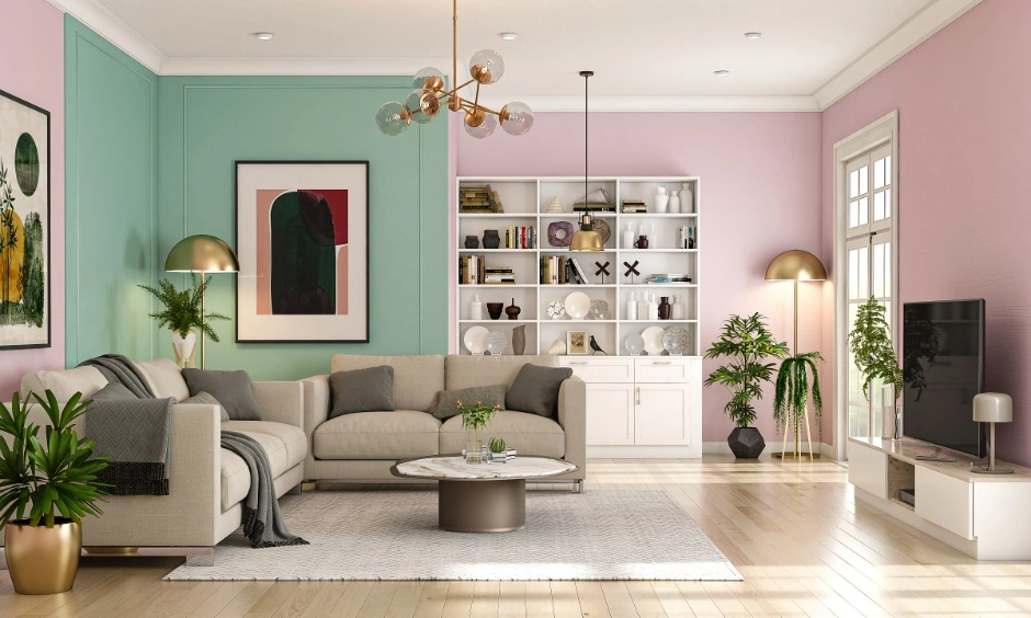

The Role Of Natural And Artificial Lighting In Interior Paint Colour Selection
North-facing rooms need warm interior wall colours to balance cool natural light. South-facing rooms handle pastels and light neutrals without looking washed out.
Artificial lighting changes how every shade reads. Yellow-toned bulbs below 3000K warm up cool colours. Daylight bulbs above 5000K reveal undertones that are invisible in dim light. Always test a 2×2 ft patch on your actual wall, at three different times: morning, afternoon, and after dark with the lights on.
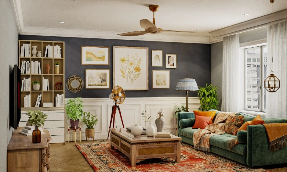
Common Home Interior Colour Mistakes To Avoid
- Choosing interior wall paint colours before finalising furniture finishes.
- Using five different accent shades across three rooms.
- Judging interior paint colours on a phone screen rather than in real light.
- Matching every room to a current trend rather than your actual lifestyle.
- Mixing warm and cool undertones across rooms (this is what makes homes feel disjointed, not the colours themselves).
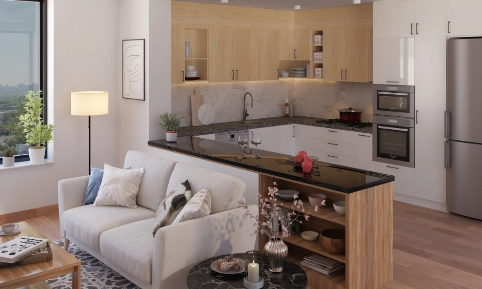
Timeless Room Interior Colour Principles That Never Go Out Of Style
Trends change. These do not.
- Satin and eggshell finishes reflect more light than matte, making any room feel brighter.
- Warm undertones age better in Indian light than cool ones.
- A shared undertone across all rooms matters more than matching shades.
- Your floor is fixed. Colour everything else relative to it.
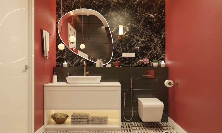
Parting Thoughts…
Colour is the one home decision that touches every surface, every room, every single day.
Start with your floor. Build your home interior colour palette from what’s fixed, not from what looked good on someone else’s Instagram. If choosing the best interior colours for your home still feels overwhelming, DesignCafe’s team can help you get it right from the first conversation.
Book a free consultation today and get expert guidance on interior design colour that actually works for your space and budget. Use our home interior cost calculator to plan your full interior.
FAQs
1. How do interior designers choose colour palettes?
They start with fixed elements like flooring and woodwork, then build the palette around them.
2. What is the best way to create a colour scheme for a home?
Choose one dominant colour, one secondary shade, and one accent colour.
3. How many colours should an interior palette have?
Three: 60% dominant, 30% secondary, and 10% accent.
4. What colours make a room look bigger and brighter?
Light shades like warm white, soft beige, and pale sage reflect more light and make rooms feel larger.
5. How does lighting affect interior colours?
Warm lighting makes colours look warmer, while daylight reveals their true undertones.
6. What is the 60-30-10 colour rule?
Use 60% dominant colour, 30% secondary colour, and 10% accent colour.
7. Should every room follow the same colour palette?
No. Different colours are fine, but a common undertone keeps the home cohesive.
8. What are the most common colour mistakes?
Choosing paint before furniture finishes and judging colours only on a phone screen.