Select Category


AI Summary
3 key insights · 1 expert tipSelecting the perfect home colours involves considering room size, lighting, and desired ambience to create a cohesive and inviting living space.
KEY INSIGHTS
- Lighter shades like off-white and pastels visually expand smaller or dimly lit rooms.
- Paint ceilings the same colour as walls for low-height rooms to create an illusion of height.
- Consider furniture colours and styles to ensure wall colours complement existing elements.
Test your chosen paint colours on a wall for a few days to observe their appearance in both natural and artificial light.
Now you won’t go wrong with home colour matching with our nine awesome tips to choose home colours the right way!
Let your home colours say the story of your soul!
Home colour matching is an essential element of interior design. It can make or break the image of your place. Hence, you must put extra care into choosing the right home colours. In interior design, colours are the quickest way of adding an impression or influencing a place’s ambience. And in terms of home colours, a large part is associated with wall colours. They cover almost 60 per cent of your home colours. The rest is from the furniture, ceiling, upholstery, floors, etc. But choosing colours for your home isn’t child’s play. You will need to go through some steps to land a suitable colour scheme for your place. However, don’t worry, this may sound super complicated, but we are here to make things easy for you. We have come up with some easy DIY tips to help you in home colour matching the right way. But before jumping to the tips, let us explore some of the steps you’d need to cover before going for the paint choice!

- Get Your Home The Suitable Primer: This is important so that the old colours of your house don’t interfere with the new colours
- Experiment With Different Colours: Don’t identify yourself with any particular colour; explore the different choices
- Consider The Surrounding Factors: Before choosing the home colours, make sure you consider the different factors: sunlight in the rooms, size of the rooms, ceiling height, etc. Some shades may look good on the colour wheel; however, they may not be suitable for your place because of light, ceiling height, etc.
- Always Note The Furniture Colours And Styles: Your furniture sets will significantly impact the home colours. So, consider all of them while picking the colours for your house
Now that you are aware of these tips prior to choosing home colours, let’s go ahead and understand the various aspects of selecting the right home colours.
Use Lighter Colour Palette For Home Colour Matching In Smaller Rooms
If your house has less space and smaller rooms, the right way to decide the home colours would be to go with the lighter shades. You can choose soft tones like off-white, light blues and greens, as they make spaces look brighter and more inviting. You can also go for shades like taupe, alabaster, pastels, earthy tones, etc. Small rooms should avoid deep colours as they might make the place look more cramped and cave-like. Whites can be a good choice for small rooms; however, flashy white can make the place look cold and soulless. You can, therefore, choose subtler whites like cream, butter, ivory whites, etc. So, if you have small rooms, go for this type of welcoming and liberal colour shades that make your house look airier and less narrow.

Paint Your Ceilings The Same Colour As The Walls For Perfect Home Colour Matching
In case you have a low ceiling height, paint your ceilings the same colour as your walls. You can go for lighter shades or whites for this one. The same colour scheme will blur the lines between your walls and ceiling, making the rooms look taller and spacious. You can also choose ceiling colours that are lighter than your wall colours. For example, if you have cream colour walls, you can go with light white colours for your ceilings. Lighter ceiling colours create the illusion of taller and spacious rooms.

Choose Shade For Home Colour Matching As Per The Ambience You Want
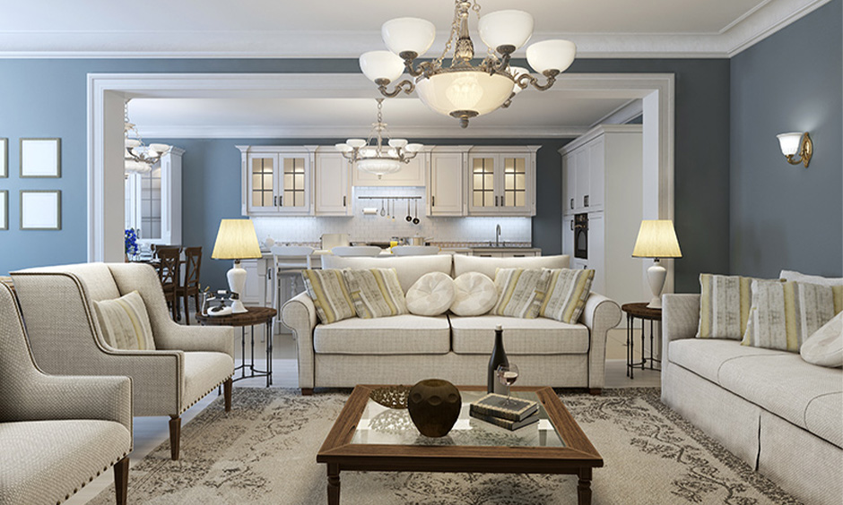
Homes can be bright, lively, warm, relaxing, opulent, peppy, etc. And this vibe of a house primarily depends on the home colours. Therefore, choosing the colours for your house the right way is to finalise the kind of ambience you want at your place. If you are more into a subtle and soothing look, go for soft tones like turquoise blue, cream, lavender, pink, etc. If you want your house to look more natural and organic, choose earthy tones like terracotta, brown, grey, soft yellows, etc. But if you wish your place to feel cheerful and upbeat, you can go with colours like orange, red, purple and vibrant shades from these colour families.
First, you’ll need to decide on your house’s vibe and then select the home colours accordingly. You can also mix and match things and form a multicolour palette for your house. This can be tricky as you have to go through each room and decide on a colour scheme relevant to the rooms. People mostly opt for lively, warm colours in living areas and earthy, soothing tones in bedrooms for a multicolour palette. Kitchens can also use a mix of vibrant and peppy colours if the place is appropriately lit and ventilated. Also, make sure you choose your colours as per the availability of sunlight. For brightly lit rooms, use light colour schemes as dark colours fade faster.


Decide Colours For Home Colour Matching As Per Your Furniture
Furniture plays a significant role in deciding home colours, especially upholsteries. Therefore, if you are redoing your home’s colours, you would want to pay attention to your furniture. If you have a light-coloured fabric couch set, go for lighter home colours like off-white, cream, white, etc. These colour combinations will create a seamless interior set-up. You can also use bright coloured accent wall designs to match the liveliness of bright furniture colours. You can go with light shades like mints, French vanilla, emerald green and subtle whites for bright and vibrant upholsteries. This will create a perfect contrast, adding vigour to the room’s interiors. You can also go for dark on the dark colour combinations, but only if you have an open and airy place. If you have patterned, printed upholsteries, go for subtle wall colours as you don’t want the room to look busy amidst bright colours.

You Can Opt For Pop Of Home Colours
While deciding your home colours, you can also go for a pop of colours in your place. Pop of colours would require you to plan your rooms as per a colour scheme with different articles adding a second colour pop. For example, the living room has a dark grey and white colour scheme that may fall flat and look dull. So, we have added pops of reds in different design elements to twist the plain colour scheme. This step is more of an interior decoration step, so you can look into this one once you are done with the colour schemes of your walls and floors. This type of pop colours works mostly with one or two colour scheme rooms. The second picture exhibits a pop of royal blue in a white colour room.


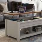
Choose Two Different But Matching Colours To Zone Areas For Ideal Home Colour Matching
If you have an open space, you can choose two colours to zone the different areas. So, if your living area has an open dining nook, you can use colours to differentiate the areas visually. You can either opt for different wall colours for both areas or use shades of different elements as demarcations. The picture below shows how you can create a separation of zones by using two colours for the sofa area and the house’s resting nook. Here the seating area has a dark brown colour scheme, and the resting nook has a mustard yellow colour. You can mix and match warm tones with neutral shades, deep colours with lighter tones, etc. Also, you can reverse this and create a uniform flow in your open spaces by using the same colour in the adjoining spaces. This will create a seamless flow in the space, while the earlier trick will help you zone places by using colours.

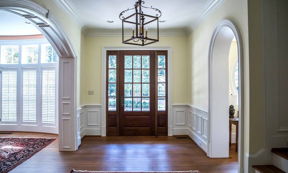
Do Home Colour Matching Based On The Architectural Structures
You can choose your home colours depending on the various architectural features in your house. It is more relevant to old-style homes with door casings, wall mouldings, wainscots, etc. Here you can choose a colour combination of two colours — one for the walls and one for these features. You can also go with one colour look for walls and wall-moulding features. Usually, people use wooden finish or white colours for door casings and wainscots.

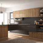
Bend The Rules And Flaunt Multiple Home Colours For Flashy Home Colour Matching
If you are up for a unique look, choose multiple colours for your home. This array of colours will not only brighten up your place but also add a unique character to it. Since using multiple wall colours can be risky, use colours in different elements just like we have used in this kitchen-cum-dining area. The pink upholstery of the dining chairs acts as the perfect accent element in the room. At the same time, the Moroccan tiles, the decorative discs on the wall, floral wallpaper, etc., add a vibrant theme to the place. If you want to go with such a multicolour look for any of your rooms, try to see the several colour combinations and then use different elements to add the colours.

Jazz Up Your Place With Stripes And Prints For A Flawless Home Painting Colour Matching
You can also choose colour stripes if you are in love with two-tone colour schemes. Stripes particularly work great for small heightened spaces as vertical stripes add height to the place. You can go with white strips combined with any of your favourite colours. The picture shows a yellow and white stripe colour combination for a vibrant bedroom design. You can also use wallpapers with stripe designs. If stripes aren’t your style, you can choose some cool home colours with printed wallpapers. It will allow you to experiment with various colour shades.


Home painting colour matching is the most imperative part of the interiors. And if you are DIY-ing this, it becomes even trickier. Just keep in mind how you want your place to feel like and then narrow the shades as per their vibe. Once you narrow down the colours, try sampling them in one of your walls and give it a day or two. This way, you’ll be able to see how the colour reacts to the room’s day and night ambience. If you still find yourself in doubt, write to us; we’d be happy to help you with your colour conundrums.
When asked about the importance of colours in home interiors, Megha Kathuria, Assistant Studio Design Manager at Design Cafe, said: “Colour can make or break a space. Each tone of colour has a significant effect on our mood and has a specific meaning with our mind frame. That is why the interior design of a home is highly dependent on its colour scheme.”
Explore, check out
FAQs
1. How do I choose wall colors based on room size and lighting?
For small or dimly lit rooms, use light shades like cream, ivory, or pastels to make the space look bigger. In large, well-lit rooms, you can experiment with bold and deep colours.
2. What are the best paint colors for small Indian homes?
Lighter shades such as off-white, soft beige, powder blue, or light green work best for small Indian homes as they create a bright and airy feel.
3. Which color combinations create a warm and welcoming vibe?
Earthy tones like terracotta, mustard, and warm beige paired with creams or whites give a cosy and inviting vibe to living spaces.
4. What are trending paint colors for Indian homes in 2026?
Trending shades include muted pastels, sage green, terracotta, deep blues, and warm neutrals that balance elegance with modern style.
5. Should ceiling and wall colors be the same for low-height rooms?
Yes, painting ceilings the same or a lighter shade than the walls helps blur boundaries, making low-height rooms appear taller and more spacious