Select Category


AI Summary
5 key insights · 1 expert tipColour choices stick around for years. Pick wrong, and your home feels oddly off. This guide covers the most popular interior design colour themes, how lighting changes everything, and what makes a palette work room to room. Whether you are starting from scratch or rethinking an existing scheme, you'll find practical answers here. From warm neutrals to Japandi-inspired palettes and luxury dark tones, each colour theme for home has a personality and a perfect match in your floor plan.
KEY INSIGHTS
- Why colour themes for home interiors set the mood before furniture does
- Six popular interior design colour themes and exactly where they work
- How to pick colours by room type and lighting direction
- Common mistakes that make interiors look disjointed
- Expert tips from Priyanka Pudipeddi, Studio Manager, DesignCafe Vizag
Priyanka Pudipeddi, Studio Manager, DesignCafe Vizag, says,"Most homeowners choose wall colours before deciding on furniture finishes. Do it the other way around. Your floor is the largest fixed surface in the room — every colour decision should start there."
Your home colour theme is either working for you or against you. Here’s how to get it right.
The wall colour you pick today will follow you for years. That’s not a reason to panic. It’s a reason to choose well. Colours shape how a room feels. The right interior design colour theme can make a 12×10 bedroom feel open. The wrong one makes a spacious living room feel claustrophobic.
Colour isn’t just about looks; it changes how your home feels. Here’s how you can hit the bull’s eye in your colour game.

Why Your Colour Theme Sets The Foundation For Interior Design?
Before flooring, furniture, or fixtures, colour sets the tone. It connects visual sightlines from the entryway to the living room. A cohesive colour palette helps every room feel connected while still giving each space its own character.
Think of it as the grammar your home speaks. Every room has its vocabulary.
How To Choose A Colour Theme For Your Home?
Start with your fixed elements, not a Pinterest board.
Your flooring, woodwork, and natural light level are the real starting points. Build your interior colour combinations around what’s already there, not what looks good on a phone screen.
| Step | What To Do |
| 1 | Note your floor colour and finish |
| 2 | Check which direction your rooms face |
| 3 | Shortlist 2-3 home interior colour schemes |
| 4 | Test paint samples during the day in natural light and at night in artificial light |
| 5 | Lock in your palette before buying anything else |
Popular Interior Design Colour Themes And Where They Work Best
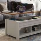
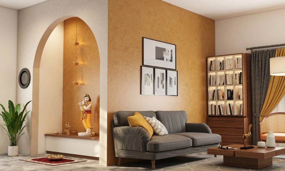
Warm Neutral Colour Themes
Warm neutrals like off-white, sand, and soft beige are the most forgiving interior colour combinations for Indian homes. They look beautiful under both natural and artificial light without feeling flat.
Tip: Avoid oversaturated warm yellows, which tend to mimic the flat lighting of commercial rentals.
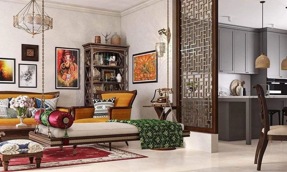
Earthy Nature-Inspired Themes
Terracotta, moss green, and warm brown make for rich colour themes for home interiors that age well. These tones pair well with traditional Indian wooden furniture, jute, and linen.
Monochromatic Grey Themes
Grey-on-grey is harder to pull off. Use warm grey with white trim to stop it from turning cold. This works best in south-facing rooms with little direct sunlight.
Japandi-Inspired Colour Themes
Japandi is all about minimalist, calming spaces. Try a palette of sage green and warm white with a charcoal accent. It’s one of the most popular colour trends for contemporary homes today.
Luxury Dark Colour Themes
Deep teal, plum red, or inky navy as accent colours instantly make a room feel luxurious when used with cooler tones. They work best in rooms that are well-lit during the day and have layered lighting.
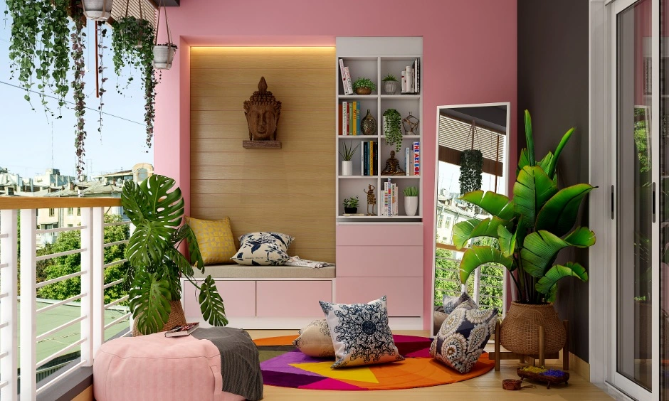
Soft Pastel Themes
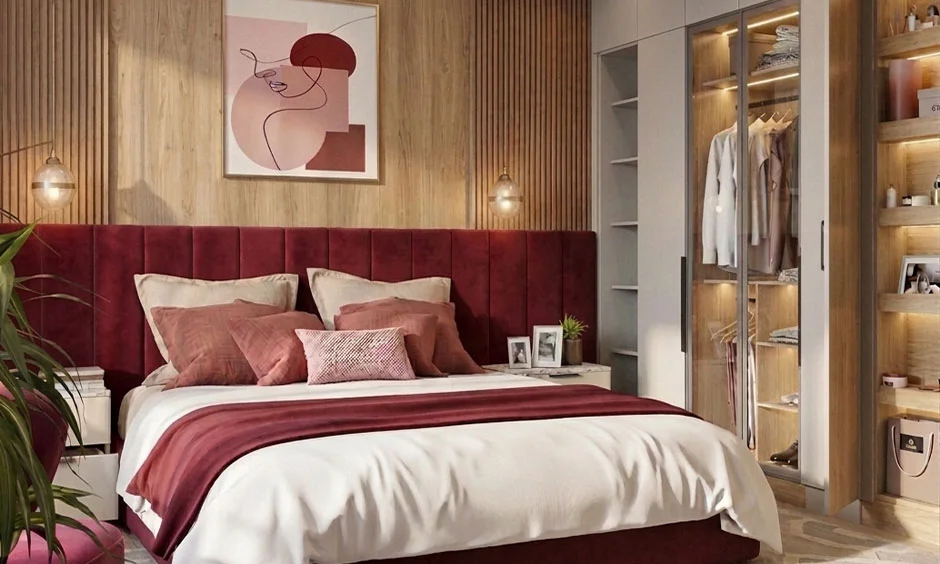
Pastels earn their place in bedrooms and children’s rooms. Dusty rose and powder blue give off a calm, relaxing feel. Pair them with whites, creams, or light grey furniture or décor to keep the space balanced.
Luxurious 2BHK Interior Designs


Choosing Colour Themes For Different Rooms
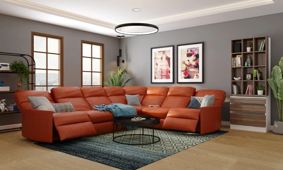
Each room has a different job. Your bedroom colour theme should help you wind down. Your kitchen colour theme should feel clean and awake. And your living room colour theme should be welcoming.
| Room | Reco”mmended Colour Theme | What To Avoid |
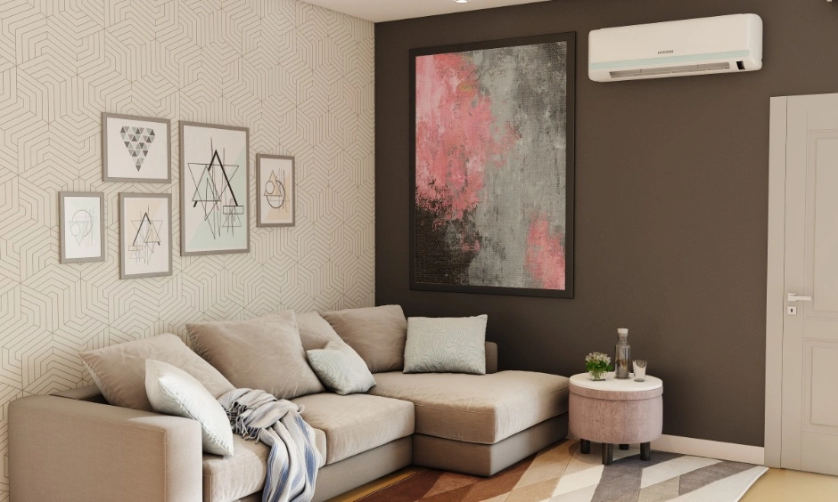
| Living Room | Warm neutrals, earthy greens | Too many accent colours |
| Bedroom | Soft pastels, Japandi tones | High-contrast, bold patterns |
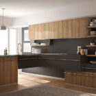
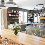
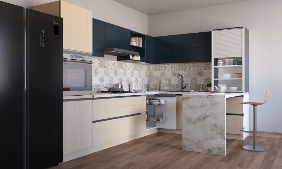
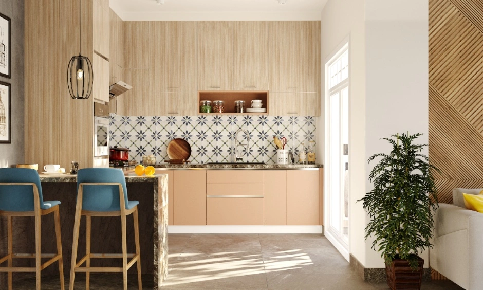
| Kitchen | Warm white, beige, light grey, sage green, wood finishes | Pure white surfaces that show oil and turmeric stains easily; dark colours in poorly lit kitchens |
| Bathroom | Cool blues, warm grey | Oversaturated or very dark tones |
How Lighting Influences Colour Perception?
The same paint colour can look three different shades depending on the light in the room.
Natural Light vs Artificial Light
A paint looks different in natural light and artificial light, especially with yellow-toned bulbs. Don’t make a decision based on a showroom sample alone. Always do a swatch test of your colour combinations in your home under both conditions before you commit.
North-Facing vs South-Facing Rooms
Wondering what room direction has to do with paint colours? Quite a lot, actually. The amount of sunlight a room gets can make the same colour look completely different.
* North-facing rooms: Choose warm-toned colours to balance cool natural light.
* South-facing rooms: Pastels and light neutrals work beautifully in abundant natural light.
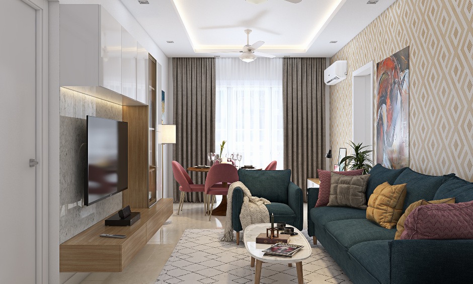
Creating A Cohesive Colour Flow Throughout Your Home
- Choose one dominant neutral colour – Pick a neutral shade such as white, beige, greige, or light grey that can work across multiple rooms.
- Use it as the foundation – Apply this colour to large surfaces like walls, ceilings, or major furniture pieces to create visual continuity.
- Add a secondary colour – Introduce a complementary shade to add depth and variety without disrupting the overall flow.
- Bring in accent colours sparingly – Use cushions, rugs, artwork, throws, and décor accessories to add pops of colour and personality.
- Follow the 60-30-10 rule – 60% dominant colour, 30% secondary colour, 10% accent colour
Colour Theme Mistakes That Can Make Interiors Feel Disconnected
Most homeowners still make these easily avoidable mitstakes. Listing them here so you don’t make these.
- Choosing wall colours before finalising furniture finishes.
- Using five different accent colours across three rooms.
- Ignoring how natural light shifts throughout the day.
- Matching every room to a current trend rather than your actual lifestyle.
- Judging colour swatches only on a mobile screen.
Interior Designer Tips For Selecting Colour Themes
Priyanka Pudipeddi, Studio Manager at DesignCafe Vizag, shares the advice she gives homeowners week after week.
- Start with your floor, not your walls – Once your floor is fixed, you are not changing it for years. This is your base. Every colour decision you make about colour theme should go with it, not against it.
- That paint colour looks different at home. Always – Shortlist your colours, then check them at three different times: morning, afternoon, and after dark with the lights on.
- Paint a 2×2 ft patch on the actual wall – Colours shift at scale. A warm beige on a swatch card can turn stark white across an entire wall.
- The ceiling affects how tall your room feels – One shade lighter than your walls draws the eye upward. Stark white on a low ceiling flattens the space instead of lifting it.

In A Nutshell: Which Colour Theme Is Right for Your Home?
There’s no universal answer. It depends on your floor plan, direction, light, and your lifestyle.
Start with what’s fixed. Build from there. If you’re still unsure, the DesignCafe team can help you choose the right interior design colour combinations from the first conversation. Book a free consultation today and get expert guidance on home interior colour schemes that actually work for your space.
Use our home interior cost calculator to get a comprehensive idea.
FAQs
1. How do I choose the right colour theme for my home interiors?
Start with your floor finish and existing woodwork. Both are fixed. Your wall colour should complement them.
2. Which colour themes make a home look bigger and brighter?
Warm whites and soft beiges reflect light well. Avoid matte finishes on walls. They absorb light and make rooms feel smaller. Eggshell or satin works better.
3. What are the most popular interior design colour themes?
Warm neutrals, Japandi palettes, and earthy tones. They work across natural stone flooring and engineered wood, the two most common floor finishes in Indian homes.
4. How many colours should be used in a home interior palette?
Three: one dominant, one secondary, one accent. The 60-30-10 ratio keeps them balanced.
5. Should every room follow the same colour theme?
No, but they should share an undertone. Mixing warm and cool undertones across rooms is usually what makes a home feel disjointed.
6. How does lighting affect interior colours?
Bulb temperature matters. Yellow-toned bulbs below 3000K warm up cool shades. Daylight bulbs above 5000K reveal undertones that are invisible in dim light.
7. What colour themes work best for modern homes?
Japandi and warm monochromatic schemes. They rely on tonal contrast and texture rather than colour contrast, which is far more forgiving to execute.
8. How do interior designers create a cohesive colour scheme?
They lock the full palette before selecting any finishes. Floor, wall, ceiling, trim. Not room by room. That’s what prevents the patchwork effect.