Select Category


From muted minimalism to moody luxe—immerse your space in colour schemes that don’t just decorate your drawing room but define it.
A well-designed drawing room doesn’t shout—it speaks softly, confidently, and in colour. The right drawing room colour combination can shift moods, shape moments, and set the rhythm of your entire home. Whether it’s an earthy neutral that calms the senses or a bold contrast that sparks conversation, the living room wall colour should reflect both who you are and how you live.
In this guide, we are not just pairing paint but curating atmospheres. Explore these nine sophisticated drawing room colour ideas that layer personality, elegance, and intention into every wall. Drawing on timeless style and modern sensibility, they are rooted in design principles. And since they are drawing room colours as per Vastu, these palettes offer more than aesthetics—they offer energy, flow, and a sense of well-being.
How to Choose the Right Drawing Room Colour Combination?
Choosing the best colour for drawing room walls starts with intention. Before you browse swatches or Pinterest boards, take stock of your room’s orientation, lighting, and layout. Natural light enhances warmer hues, while cooler tones can balance sun-drenched spaces. Think about how you want the room to feel—energising, cosy, open, or intimate.
If you believe in Vastu Shastra, direction matters:
- North- or east-facing rooms do well with light blues, greens, or neutrals.
- South- or west-facing spaces can accommodate bolder tones, such as terracotta, gold, or deep browns.
A good drawing room colour scheme isn’t just trendy—it’s timeless, tailored, and aligned with your space’s emotional needs.


Tips for Creating the Best Colour Combination for the Drawing Room
When it comes to drawing room colour design, balance is everything. Here’s how to create harmony without monotony:
- Use the 60-30-10 Rule: This means your room should have- 60% primary shade, 30% secondary, and 10% accent colour.
- Pair Textures With Colour: Consider how you can incorporate colour and textures to create a personalised narrative about you and your home. For example, a matte sage wall sits next to velvet ochre cushions.
- Play With Light: Glossy finishes reflect more light and open up small spaces; matte tones bring softness and depth.
- Try a Two-Colour Combination for Drawing Room Walls: Contrast or complement—make sure the undertones align.

Here are some colour combination ideas to try out in your drawing room:
1. Dove Grey & Lemon-Yellow: A Bold Drawing Room Wall Colour Scheme
This high-contrast duo oozes charisma. The dove grey walls act as a dramatic canvas for lemon-yellow accents, lighting fixtures, or upholstery. It’s moody, modern, and magnetic—the kind of palette that makes guests stay a little longer.

2. Sage Green & Warm White Drawing Room Colour Design
For a nature-inspired look, sage green paired with warm white brings a fresh and calming effect. This colour partnership is ideal for east-facing drawing rooms. When searching for a drawing room colour, according to Vastu, this combination aligns beautifully, creating a soft and contemporary feel.

3. Pink & Ivory: Trending Colour Shades for Drawing Room
Grounded and glowing- this combination channels warmth and authenticity. Pink walls or accents pair beautifully with creamy whites for a Mediterranean-inspired aesthetic. This partnership is a perfect choice for west-facing spaces or tropical homes, as it helps keep the room looking cool.

4. Olive Green & Ochre Yellow: Drawing Room Wall Colour Design
Earthy yet eclectic, olive green walls with ochre trims or upholstery create a lush, grounded atmosphere. Layer in wood and brass details to make this palette sing. It’s also a Vastu-friendly choice for rooms that need warmth and energy.

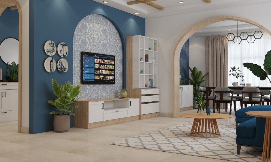
5. Pearl Grey & Dark Blue Create a Serene Drawing Room Colour Scheme
This cool and calming duo is ideal for spaces that receive ample natural light. Dark blue injects subtle personality into the neutral palette, creating a tranquil, spa-like feel without veering into sterile.

Premium Living Room Designs


6. Warm Rust & Deep Plum Drawing Room Interior Colour
This colour combination is luxe, layered, and endlessly stylish. Deep plum walls create a rich backdrop, while warm rust adds drama and depth through furniture, curtains, or art. It’s a sophisticated, grown-up pairing that speaks volumes.

7. Classic White & Lavender: A Timeless Drawing Room Colour Design
Nothing beats the crispness of classic white walls layered with lavender textiles and artwork. This drawing room wall colour combination is timeless and versatile, letting your furnishings take centre stage. Enhance the ambience and the calming effect of white by using marble floors. You could also opt for light-toned tiles.

8. Teal & Sand: An Inviting Drawing Room Colour According to Vastu
Teal energises any space without overwhelming it while sand-shaded walls soothe, creating a balanced space in line with Vastu principles. This combination is ideal for south-facing rooms. Trust this pairing to encourage creativity, calm, and connection.

9. Burnt Sienna & Porcelain White: Talk About Rich Drawing Room Colour Shades
Burnt sienna brings a rustic charm, while porcelain white adds a contemporary edge. Together, they create a serene storytelling palette that works beautifully with natural textures, such as linen, cane, and stone. By using white and black accents, the place comes alive with a layered thoughtfulness.

The right drawing room wall colour combination doesn’t just enhance a space—it elevates it. From soft, sunlit tones to bold, expressive pairings, these ideas are crafted to create emotion, movement, and meaning in your home.
Whether you are drawn to serene neutrals or statement contrasts, let your drawing room become a canvas for intentional design. Choose a colour scheme that not only looks good but feels right, anchored in your style, your story, and your sense of space.
Confused about where to begin? Talk to the experts at DesignCafe for more!
Also, Check Out Our
- Bedroom Vastu Shastra Tips for Positive Energy
- 5 Basic Vastu Tips For Your Home
- Guidelines For Main Door Vastu For Your Flats
- Kitchen Direction As Per Vastu For Your Home
FAQs
1. What is the best colour combination for a small drawing room?
Soft neutrals, such as warm white, light grey, or beige, paired with pastels or muted tones, work best. These drawing room colour combinations create the illusion of space and brightness.
2. How do I choose the right colour combination for my drawing room?
Consider your room’s lighting, layout, and mood. Use drawing room colour as per Vastu for harmony, and pair neutrals with accents for balance.
3. Can I use dark colours in a drawing room?
Yes, dark drawing room wall colours like charcoal, navy, or plum add depth—balance them with lighter accents or natural light.
4. Are warm tones better for drawing rooms?
Warm tones like terracotta, beige, or mustard create a cosy, welcoming feel. They’re ideal drawing room colours, according to Vastu, for south or west-facing rooms.
5. Can I mix multiple bold colours in the drawing room?
Yes, you can. For an intentional drawing room colour design, combine bold shades with grounding neutrals and stick to a 2-3 colour palette.
6. What colours go well with wood furniture in a drawing room?
Earthy tones, such as olive, taupe, and cream, or cool contrasts, like ice blue and dove grey, work beautifully with wooden furniture in drawing room interiors.