Select Category


AI Summary
3 key insights · 1 expert tipUnderstanding colour psychology in interior design unlocks how hues evoke emotions, enhance moods, and alter space perception for harmonious, impactful living areas.
KEY INSIGHTS
- Warm hues energize; cool tones promote calm, affecting room ambience and occupant well-being.
- Light colours visually expand spaces, while darker shades create intimacy and drama.
- Accent walls in bold colours like red create focal points, balanced by neutral pairings.
Use blue for bedrooms to foster serenity, accenting with lighter shades for an airy feel, and darker tones for sophisticated living areas.
Embark on a colourful journey to unlock the secrets of colour psychology in interior design that turn hues into storytellers
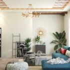
Ever walked into a space and instantly felt a sense of calm? Or entered a room that made you feel energized and alive? The secret lies in the power of colours. Colours have an extraordinary ability to captivate our senses, transform the ambience of any space, and affect our overall well-being. Understanding colour psychology in interior design is essential for creating impactful and harmonious spaces that resonate with the occupants on a deeper level.
Whether you want to create a cosy sanctuary, a vibrant and energizing environment, or a serene oasis, the colours you choose play a vital role. In this blog, we will explore the captivating world of colour psychology in interior design and discover how different hues can shape our experiences within our homes. So get ready to harness their psychological impact to create a home that truly speaks to your soul.
The Importance Of Colour Psychology In Interior Design
Here are some reasons why you need to be aware of the psychology of colours while designing your home:
- Emotional Impact: Colours can evoke specific emotions and feelings. Warm hues can create a sense of energy and excitement, while cool tones promote calmness and relaxation. By strategically incorporating these colours into different areas of your home, you can create the atmosphere you desire from a space.
- Mood Enhancement: Did you know colours can uplift your mood and enhance your overall well-being? Yes! Bright and vibrant shades instil joy and positivity, making a space feel more lively and energetic. On the other hand, soft and muted tones help create a tranquil atmosphere, perfect for areas of relaxation and introspection.
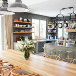
- Visual Perception: Colours can significantly impact how we perceive and experience a space. Lighter colours make a room feel more spacious and open, while darker shades create an intimate ambience. By manipulating the colour palette, you can depth and dimensions to a room, making it more visually appealing.
- Personal Expression: Colours are a powerful means of self-expression and a great medium to showcase your unique personality. Understanding the psychology of colour allows you to tailor the colour scheme to your taste, creating spaces that resonate with your style and preferences.
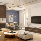
The Psychological Impact Of Different Colours
Let’s look at some popular colours and their effects on each space and how they can be combined with other colours to create balanced home interiors.
Blue Colour Psychology In Interior Design
Symbolizing calmness, serenity, and tranquillity, blue can transform any room into a soothing oasis that invites relaxation and rejuvenation. The colour blue perfectly captures the vastness of the sky and the calmness of the ocean. This evokes feelings of peace, harmony, and stability, making it an ideal choice for spaces where you want to unwind and find solace.
Lighter shades like sky blue or baby blue can create an airy and open feel, perfect for smaller spaces or bedrooms that lack natural light. On the other hand, deeper shades such as navy or royal blue bring a sense of sophistication. This makes them ideal for creating an elegant atmosphere in the living room.


Red Colour Psychology In Interior Design
Imagine entering a room that immediately captivates your attention, igniting a sense of passion and energy. That’s the power of the colour red in interior design! Bold, vibrant, and undeniably attention-grabbing, red is a colour that demands to be noticed. In interior design, red is associated with a range of powerful emotions, making it a popular choice for those who want to create a dynamic atmosphere in their home.
One of the most impactful ways to utilize this passionate colour is through accent walls. Painting a single wall in a vibrant red shade instantly becomes the room’s focal point. The red accent wall becomes even more striking when paired with neutral or complementary colours, such as white, grey, or black. Incorporating red through furniture and accessories can be an excellent choice for those who prefer a more balanced approach.

Green Colour Psychology In Interior Design
With its association with nature and the great outdoors, green instils a sense of harmony and balance in interior design. Studies have shown that exposure to greenery can positively impact mental health and reduce stress. This is why walking into a room with green walls instantly transforms your mood as it creates a refreshing atmosphere.
Soft, muted greens like sage or mint can be soothing and relaxing. On the other hand, earthy hues like olive or forest green convey a sense of sophistication. Beyond wall colour, green can be incorporated into interior design through furniture, upholstery, and accessories. Additionally, incorporating plants or vertical moss frames further enhances the green colour scheme and makes you feel closer to nature.

Yellow Colour Psychology In Interior Design
Incorporating yellow into your interior design is a surefire way to infuse your home with optimism and warmth. With its radiant and sunny disposition, yellow has the remarkable ability to illuminate spaces and create a cheerful atmosphere. This is why yellow is associated with joy, enthusiasm, and creativity. A yellow sofa, headboard, or even yellow cushions can add a burst of colour and vibrancy to your space.
Painting a wall or even an entire room in a warm shade of yellow can instantly brighten the space and create a sense of openness and positivity. On the other hand, pale or pastel shades of yellow work well in creating a soothing ambience. Pairing yellow with grey or white can create a modern and sophisticated look. And when it’s combined with blue or green gives your room a fresh and natural feel.

Purple Colour Psychology In Interior Design
Have you ever wondered how colour can convey a sense of luxury, mystery, and drama all at once? That’s the psychological impact of purple. With its rich and regal undertones, purple adds a touch of elegance to any space. From deep and dark shades like royal purple or eggplant to lighter tones like lavender or lilac, the range of purple hues allows for versatile and captivating design choices.
Darker purples can create a sense of drama and opulence, making them ideal for creating statement walls or focal points. On the other hand, lighter shades help create a soft romantic look, perfect for bedrooms or guest rooms. Purple can be paired with gold or silver accessories for a glamorous look. But purple furniture on its own can lend a luxurious and regal touch to any space.


Brown Colour Psychology In Interior Design
When it comes to creating warm and inviting spaces, the brown colour reigns supreme. Brown is a timeless hue that adds a touch of earthy elegance to any interior design. Since it symbolizes stability and a connection to nature, brown is often associated with feelings of comfort. Like the soothing embrace of a warm cup of cocoa on a chilly day, brown tones evoke a sense of cosiness and contentment. This makes it an ideal choice for living rooms where a relaxing vibe is paramount.
One of the remarkable qualities of brown is its ability to add a touch of earthiness. From rich mahogany wood furniture to an accent wall in chocolaty brown, from cabinets in light sandy tones to a deep brown leather sofa – this colour is highly versatile. Lighter shades of brown are perfect for beach-inspired or Scandinavian-style interiors. Alternatively, they are ideal for traditional or rustic theme interiors.

White Colour Psychology In Interior Design
White is a colour that knows no boundaries, a blank canvas awaiting your creative touch. It signifies purity, cleanliness, and simplicity. This is where its remarkable ability to open up a room comes into play, making spaces appear bigger and brighter. It’s the perfect choice for smaller spaces or areas that lack ample sunlight, instantly making them look more airy. The best part? White seamlessly adapts to any design style – be it modern, Scandinavian, or even eclectic.
The minimalist nature of white encourages a clutter-free environment. White walls, for example, serve as a backdrop to effortlessly showcases your personal style – be it colourful artwork, vibrant furniture, or unique decor pieces. It invites you to curate your sanctuary, a space reflecting your personality and taste. Mixing different textures like fluffy rugs or rattan furniture with smooth white walls adds visual interest and tactile appeal.

Black Colour Psychology In Interior Design
Black, the colour of mystery and drama, exudes timeless elegance and is often used to create a striking visual contrast. It has a bold and commanding presence – whether it’s a tiled wall in the powder room, a wardrobe, or a textured black accent wall. At the same time, it lends timeless elegance and class while creating depth and contrast. This is why it blends seamlessly with any style- modern, minimalist, or traditional -all interior design styles use white.
Incorporating black into your home interior design scheme adds a touch of drama and intrigue. It creates a captivating interplay of light and dark when paired with lighter hues. Whether it’s a black-and-white colour scheme or a combination of black with metallic accents, the contrast will create a dynamic atmosphere. Use it to create a sense of intimacy and cosiness in smaller spaces or as a sleek and modern backdrop for larger areas.

We hope you enjoyed discovering this mysterious language of colours and exploring the world of colour psychology in interior design. By understanding the power of colour psychology, you can create harmonious and emotionally appealing home interiors that resonate with your style. As you embark on your interior design journey, don’t hesitate to step outside your comfort zone and explore new possibilities. And if you need help on this journey, our designers are here to help!
FAQs
1. What is colour psychology in interior design, and how does it affect the ambience of a room?
Colour psychology in interior design is the study of how different colours impact our emotions, moods, and perceptions within a space. It explores the psychological and emotional effects that colours have on individuals. Colours can be used to make a room feel more spacious, cosy, and intimate or even stimulate creativity and productivity. Understanding colour psychology helps designers make informed choices about colour schemes, furniture, accessories, and lighting to achieve the desired psychological and emotional effects.
2. How do different colours affect our moods and emotions, and how can they be used in interior design?
Colours have the power to influence our subconscious mind and trigger emotional responses. For example, warm colours like red and orange create an energetic and exciting vibe, while cool colours like blue and green promote relaxation and calmness. In interior design, it’s possible to transform a space into a harmonious and emotionally appealing environment by utilizing the right colours in the right proportions.
3. What are some popular colour schemes in interior design, and how do they influence the atmosphere of a room?
Several popular colour schemes in interior design can influence the atmosphere of a room. Here are a few examples:
- Monochromatic: This colour scheme uses different shades, tints, and tones of a single colour. It creates a cohesive and harmonious look, adding depth and visual interest to the space. Monochromatic colour schemes evoke a sense of elegance and sophistication.
- Complementary: This colour scheme involves using colours opposite each other on the colour wheel. Examples include combinations like blue and orange or purple and yellow. Complementary colour schemes create a dynamic and visually striking look. They can add a vibrant and energetic atmosphere to a room.
- Neutral: Neutral colour schemes use colours like white, grey, beige, or brown as the dominant palette. These colours are called neutral because they allow other elements in the room to stand out. Neutral colour schemes create a sense of simplicity, elegance, and versatility.
- Analogous: This colour scheme involves using colours adjacent to each other on the colour wheel. For example, combining shades of blue, green, and teal. Analogous colour schemes create a sense of harmony and unity, as they are naturally pleasing to the eye.
4. What are the basic principles of colour theory, and how can they be applied to interior design?
Here are some key principles of colour theory and how they can be applied to interior design:
- Always start with a hero colour. Choose a colour based on the atmosphere you want to create in the given space.
- Next, use the colour wheel to select supporting colours. Use the colour wheel to understand colour harmonies and combinations.
- Keep in mind ‘colour harmony’ that is, picking a pleasing combination of colours for a space. Applying colour harmony principles helps create a balanced and visually appealing interior.
- To highlight specific elements in a space, such as focal points or architectural features, use different colours to create contrast. Contrast can be achieved through complementary colours, light and dark shades, or warm and cool tones.
- Colours can impact our moods and emotions. Understanding the psychological effects of colours can help in selecting hues that align with the desired mood and atmosphere of a room.
- The colours you choose should be distributed proportionately throughout the space, considering factors such as room size, furniture placement, and desired focal points. This helps in maintaining a visual equilibrium.
5. How can colour be used to create the illusion of space, and what colours are best for small or large rooms?
Lighter colours, such as whites and pastels, make a space feel more open and spacious. They reflect more light, creating a sense of airiness and brightness. Light-coloured walls, ceilings, and floors can visually expand the space and make it feel larger. Neutral colour walls, such as beige, grey, or taupe, can provide a versatile backdrop that visually expands the space. Neutrals create a balanced and serene atmosphere, allowing other elements in the room to stand out.