Select Category

Thinking neutrals? Make your home a masterpiece, not a mistake, by dodging these top neutral paint colour errors.
Neutral paint colours are the unsung heroes of home decor, timeless, versatile, and oh-so classy. But let’s be honest, they are also a bit tricky. Sure, they seem like the safe choice, but even the most subtle beige or grey can go from ‘chic and cosy’ to ‘boring and blah’ if you are not careful.
Have you ever picked a lovely taupe, only to find it looks suspiciously green under your lighting? Or maybe your neutrals left your room feeling more like a colourless cave than a sophisticated retreat?
Don’t worry, we’ve all been there! Let’s talk about how to avoid these common pitfalls.

What are Neutral Paint Colours in Home Decor?
Neutral paint colours are classy, adaptable, and totally stress-free. We are talking about shades like soft whites, calming beiges, dreamy greys, and even those warm taupes. They might not scream “Look at me!”
However, don’t underestimate neutral colours for walls. These shades are the perfect backdrop to make your furniture, art, and accents pop. In fact, neutrals act as the dependable best friend who always gets along with everyone. They can match bold patterns, complement vibrant hues, or exude understated elegance on their own.
Bonus?
Neutral wall colours work in literally every room, from a sleek modern kitchen to a cosy, book-filled den. The best part? You don’t have to commit to trendy colours that could feel dated next year. Neutrals keep it chic and timeless, so your walls stay fabulous for years to come!
How Neutral Paint Colours Can Transform a Space?
Neutral walls are like the backstage crew of your home. They set the scene without stealing the spotlight. These colours work with everything!
Neutrals can also be the secret sauce that makes your space feel bigger and brighter. You can throw in some cosy rugs, a few woven baskets, or maybe a chic leather ottoman, and you have built yourself an inviting, refreshing space.
Don’t forget the magic of lighting in a neutral-toned space. A warm glow from a floor lamp or twinkling string lights enhances the cosy vibes. Natural light? It’s like nature’s Instagram filter, making everything look effortlessly amazing.
The real beauty of neutrals, though, is that they can be your style playground. Swap in some bold pillows, quirky art, or trendy decor whenever the mood strikes– Voilà, total room makeover with zero hassle.
7 Common Mistakes to Avoid When Choosing Neutral Colours for Walls
1. Going Too Matchy-Matchy
Neutrals are versatile, yes, but let’s not make your space look like a beige explosion. Mixing tones and textures is the key when opting for neutral colours for walls. Pair warm neutral paints with cool ones or throw in a splash of something bold for contrast. A room where everything is the same sandy beige? That’s a snooze-fest.
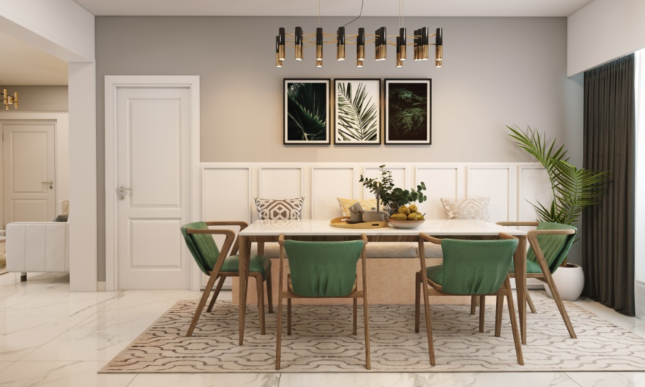
2. Ignoring Texture When Choosing Neutral Paint Colours for Living Room
Neutral paint colours for living room can feel boring if you don’t add some pizzazz! Layer textures like woven rugs, fluffy throws, glossy ceramics, or matte curtains. Textures give your space a personality makeover because monotone walls with no dimension are just plain sad.
3. Opting for Neutral Paint Combinations & Missing the Lighting Effect
Lighting changes everything. A neutral that looks fab in the store might turn into a sad grey swamp in your dim living room. So, always check your chosen shades in different lighting, morning, evening, lamps, and candles, before making that big commitment!
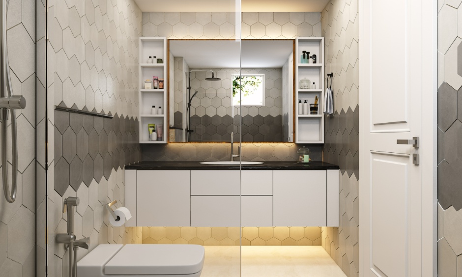
4. Forgetting to Add Depth When Going with a Neutral Bathroom Paint Colour
Flat neutrals without any depth are an interior design Waterloo. Avoid that by incorporating different tones of the same colour family and mixing light and dark shades. You can go for a bold accent piece or darker trim to keep things lively.
5. Leaving Everything Bare
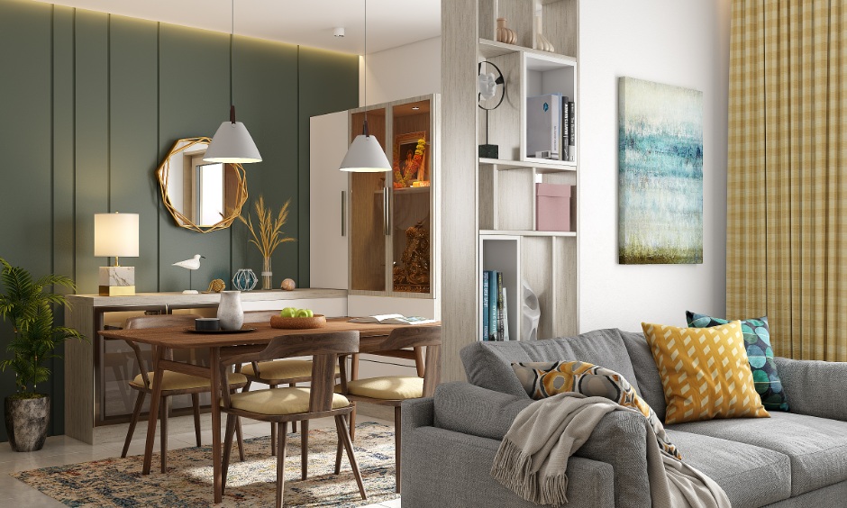
Neutral walls are the perfect backdrop, but they can’t carry the show alone. Add art pieces, plants, or statement furniture into neutral paint combinations to make your space pop. Think of neutrals as the canvas, and you’re the artist. Don’t leave it blank!
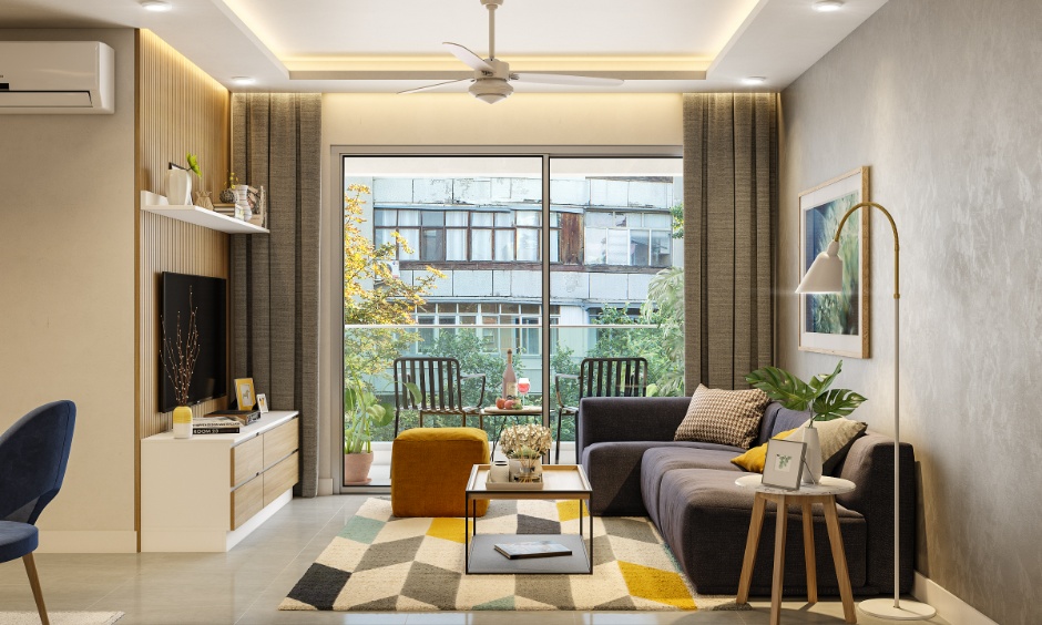
6. Overwhelming Small Spaces With One Neutral Paint Colour
Using only one light neutral in a small room might sound smart, but it can actually make the space appear washed out. Try mixing light neutrals with darker shades for contrast, or add some mirrors to bounce light around.
7. Forgetting That Not All Neutrals are Created Equal
Not all neutrals blend well together. A warm beige might clash hard with a cool grey, and suddenly your chic vibe feels like an identity crisis. Always pay attention to undertones (yes, they’re sneaky!) and make sure your neutral paint combinations are actually playing nice together.
Tips to Style Neutral Wall Colours the Right Way
- Layer Textures Like a Pro: Smooth, rough, fuzzy, shiny, mix and match textures to give your neutral space depth and personality.
- Pop Goes the Colour: Neutrals are the ultimate blank canvas, so sprinkle in a fun pop of colour.
- Play With Patterns: Stripes, polka dots, herringbone, patterns bring movement to the party, so don’t be afraid to throw a patterned rug or funky wallpaper in the mix.
- Glow it Up: Lighting is everything! Warm, soft light can make neutral tones feel cosy and inviting, while bright light amps up the crisp, modern vibes.
- Don’t Forget the Greens: A little plant life transforms any space. Add some leafy friends for a natural, fresh feel, and bonus points for the oxygen boost!
Premium 3BHK Interior Designs


Best Neutral Paint Combinations for Walls
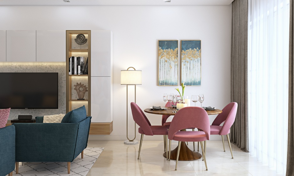
Blush Pink & Charcoal Grey
The soft, romantic vibe of blush pink paired with the bold sophistication of charcoal grey? This duo strikes the perfect balance of sweet and serious. Add gold accents, and it’s practically royalty-level chic.
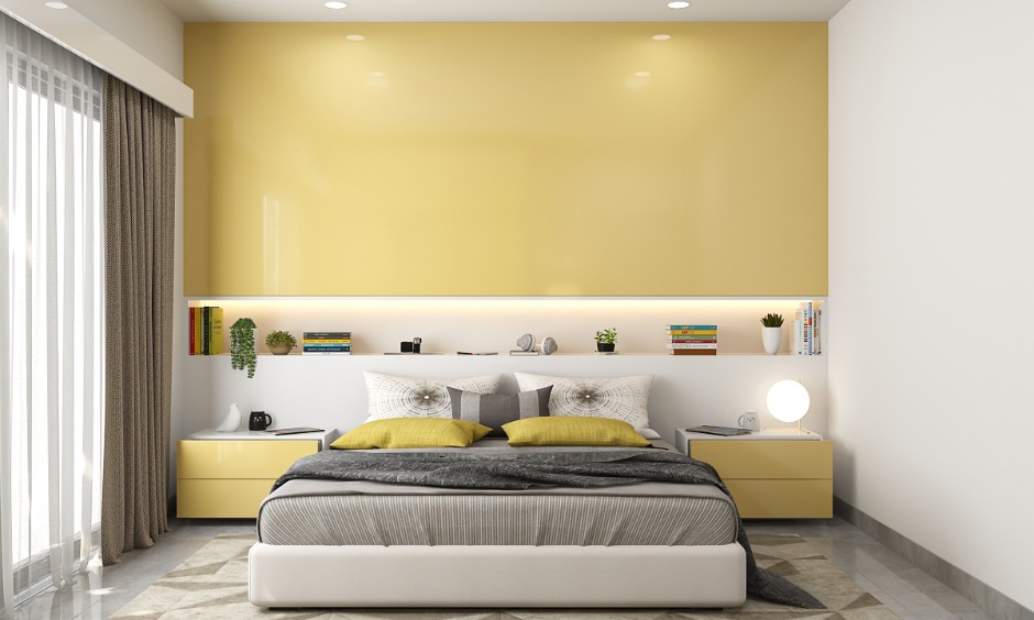
Mustard Yellow & Taupe
Mustard yellow adds that pop of happiness to grounded taupe tones, creating a look that’s vibrant yet laid-back. Whether it’s a mustard accent sofa against taupe walls or some bold mustard plant pots, this combo proves opposites really do attract.
Emerald Green & Beige
Nature is calling, and you’d better answer with some emerald green magic. Pair it with warm neutral paint colours, like beige tones, for a lush, luxurious feel that screams ‘fresh start’ while still keeping things effortlessly elegant. Add some plants and natural textures for those ultimate modern jungle vibes.
Teal Blue & Crisp White
Dreaming of a coastal escape? Combine the fresh brightness of crisp white with cool teal blue. Whether it’s a teal accent wall or a set of cushions, this pairing is all about keeping it cool and timeless. Infuse a sense of balance with beige or sand-brown elements to round out the look.
Terracotta & Cream
Bring the heat with earthy terracotta tones, softened by creamy whites. This duo exudes warmth and comfort, like sipping a latte in the desert. It’s perfect for bohemian spaces, textured throw pillows, and Moroccan-style rugs.
Unlock Endless Possibilities with Neutral Paint Colours!
While neutral colours for walls are a timeless choice, there are some common mistakes to avoid when incorporating them into your home decor. With thoughtful execution, neutral paint combinations will exude warmth, style, and enduring charm.
Want to nail the perfect neutral look without any stress? At DesignCafe, our experts are here to turn your Pinterest dreams into reality. Get a free design consultation and make sure every step of building your dream home is absolutely spot-on. We’ve got your back!
FAQs
1. What are the best neutral paint colours for home interiors?
Some of the best neutral paint colours include shades like beige, taupe, greige, soft white, and light grey. These timeless tones create a versatile backdrop, making them perfect for virtually any style or aesthetic preference.
2. How do I prevent a neutral room from looking dull?
To keep a neutral room lively, you can use layered textures, patterned upholstery, and vibrant accents. Incorporating a variety of materials, such as wood, metal, and textiles, also adds depth and personality.
3. Can I mix warm and cool neutral colours in the same room?
Yes, mixing warm neutral paint colours and cool neutral colours can create balance and visual interest. Pairing soft greys with creamy whites or sandy beiges can create a harmonious interplay of tones, especially when unified by accent pieces or decor.
4. Which accent colours go best with neutrals?
Bright accents like mustard yellow, navy blue, emerald green, or blush pink pair beautifully with neutral wall colours. These shades add character and vibrancy, creating focal points while allowing the neutral base to remain timeless and unobtrusive.
5. Are neutral paint colours suitable for small spaces?
Yes, neutral paint colours are ideal for small spaces. Light tones like off-white or pale grey can make a small room feel larger and brighter by reflecting natural light, while dark neutrals can lend cosy sophistication if well-lit.