Select Category


Ditch the dull and embrace the home glow because pastel wall colours are here to steal the show! Read here.
Pastel wall colours are working their magic in Indian homes!
Pastels never scream for attention but know how to stand out and make a statement. Choosing the right pastel colour for your home interiors is more than just selecting a pretty shade. It’s also about picking hues that work wonders with the lighting and uplift the mood as well.
Read on to know which pastel colours can uplift your home and be conversation-starters. Let’s paint your walls happy!
Benefits of Using Pastel Paint Colours for Walls
Did you know that the colours on your walls directly impact your mood, the lighting and the overall vibe of your home? Pastel shades do this effortlessly while also adding a breath of fresh air. But their magic isn’t just about aesthetics; these shades also hold the power to transform any space. Let’s further explore why pastel paint colours for walls are more than just a design trend.
- Perfect for a Calming Ambience
Colours like soft pink, mint green, and light blue can spread a soothing vibe inside your home. Homes where relaxation is the key should have light-coloured walls. Pastel pink, for example, reduces stress levels and spreads warmth and comfort. On the other hand, Mint Green is known to bring freshness to the space. Beyond the colour psychology, the soft shades also prevent harsh glares and bring a natural glow throughout the room.
- Bigger and Brighter Spaces
Pastel colours emphasise reflecting more natural light, creating an illusion of more space, and the room feels airy. This trick works well for small apartments, where living room pastel wall colours can turn a compact space into a more open area.
- Looks Good With Any Interior Style
Whether your home has a minimalist vibe or contemporary, modern or vintage style, pastel shades can effortlessly blend with any home interior style. Their versatility is why many homeowners wish to incorporate them into their homes.
- Pairs Well with Bold Decor
A light pastel colour wall makes different elements in the room stand out without making the room look cluttered. Your statement furniture or any bold artwork in the room will continue to receive the limelight it deserves, as softer shades don’t overshadow other elements in your space.
- Easy to Maintain and Refresh
No need to worry about stains or daily wear and tear with pastel paints as these are easy to maintain. Pastel shades are also easy to paint over, and this quality makes your home interiors a hassle-free experience.


Best Pastel Wall Colour Combinations for a Balanced Look
We asked our Associate Studio Manager, Mufaddal Bharmal, to share his expert insights on how to use these shades effectively. Here’s what he has to say:
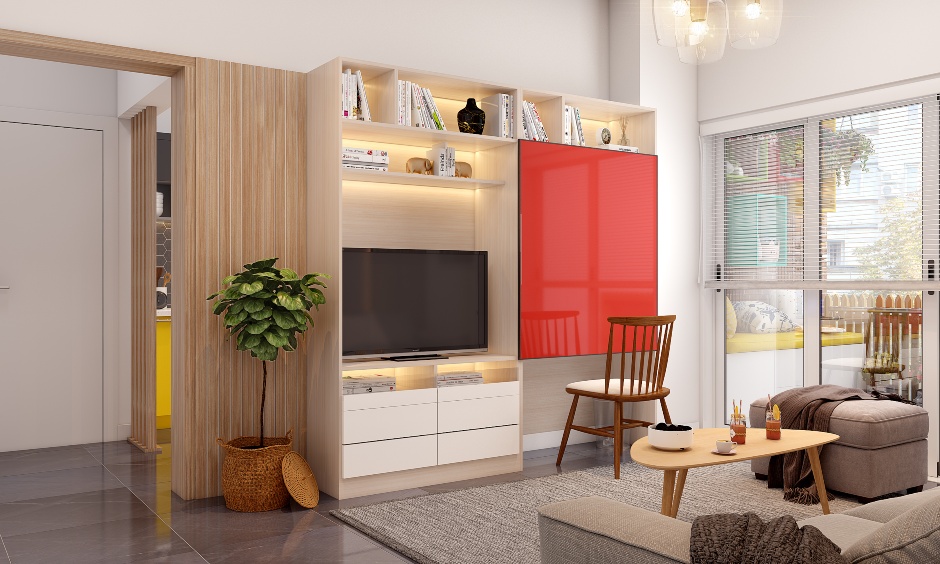
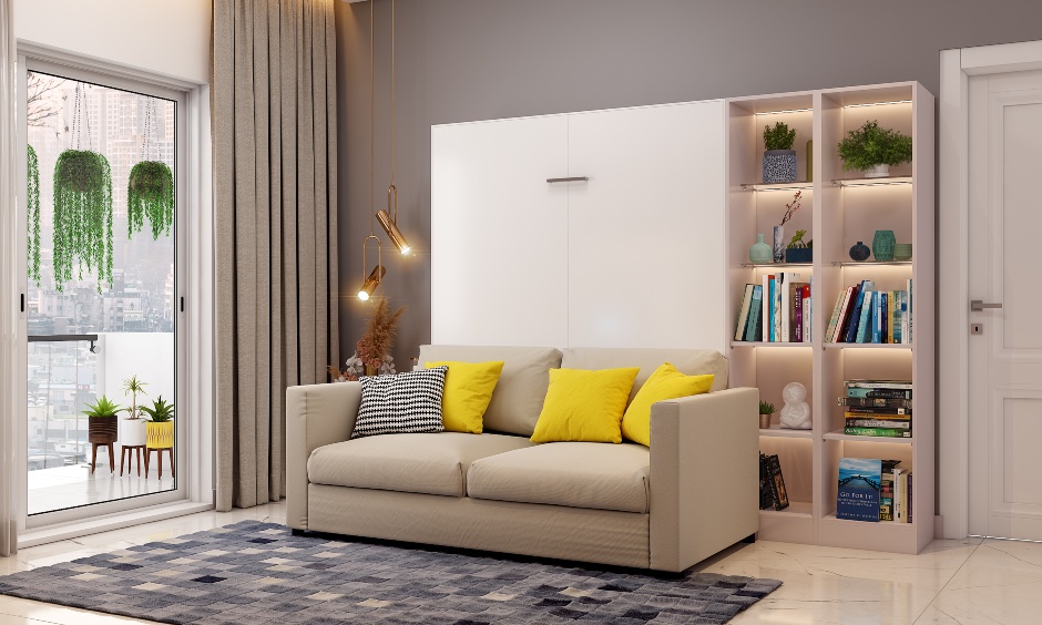
Living Room
- Living room pastel paint colours walls play an important role in creating a minimalist and welcoming vibe. Keep your walls simple and plain to make the space look bigger and brighter. This hack allows other design elements to enjoy their share of the limelight.
- Pastel shades like sage green and pink are some of the currently trending colours. These not only brighten up the living room but also highlight other elements like curtains, furniture and rugs.
- Here’s a pro tip that you can try in your living room. Go with cove lighting features and add planters to enhance the atmosphere and give your living room an airy look.

Kitchen
- Dark pastel shades look suitable for the base units as these are more exposed to frequent use. Light pastel wall colours are recommended for upper cabinets to keep the space open and airy.
- Playing with dado tiles and cabinet handles is a great way to give your kitchen a new personality. You can even customise your countertop to match your Dado tiles for a seamless, coordinated look.

Bedroom
- Usually, darker shades are recommended for bedrooms because they create a cosy, restful atmosphere. The darker the space, the better you’ll sleep.
- However, a clever way to incorporate pastel colours for bedroom walls is by using pastel wallpaper on one wall while keeping the curtains and wardrobes in deeper shades for contrast.
- Unlike the living room, which is designed to be welcoming, the bedroom is all about comfort. A well-balanced mix of bedroom wall paint colours, pastels and darker hues can help create a perfect sleep-friendly environment.

Also, check out Bedroom Pastel Colour Ideas
Some Other Recommendations for Pastel Colour Combinations:
- Light Lavender + Smoke Grey – Ideal for a calm and cosy bedroom.
- Mango Yellow + White – A cheerful and energetic bedroom mix.
- Sage Green + White – A refreshing and airy living room combination.
- Cotton Candy Pink + Light Beige – A warm and elegant living room choice.
- Pastel Blue + White – A fresh and clean kitchen aesthetic.
- Turquoise Green + Beige – A vibrant yet balanced kitchen look.
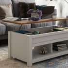
Innovative Space-Saving Designs


Lighting and Its Impact on Pastel Paint Colours for Walls
The way lighting interacts with your walls can change the appearance throughout the day. Whether it’s natural light entering through your window or carefully placed artificial lighting, it’s important to understand how lighting influences pastel wall colours.
- Natural Lighting: For Enhancing the Softness of Pastels
Spaces with ample natural light help enhance the impact of light pastel colour walls. Sage green and pastel pink look warm and vibrant in a room that receives the most daylight. If any room in your house lacks ample natural light, choose light-coloured walls paired with artificial lighting to apply a cosy feel.
- Artificial Lighting: Set the Right Mood
The type of artificial lighting directly affects pastel paint colours for walls that will appear after sunset. Little yellow-toned lighting is good enough to enhance the effectiveness of pastel shades like lavender or beige. On the other hand, you can pair cool white LED lights with pastel blues or greens.

Maintenance and Cleaning Tips for Light Pastel Colour Walls
Light pastel walls bring in airy and elegant charm in any room, but their delicate shades require extra care to stay and look fresh. The best thing? Maintaining these shades is not as tricky as it might seem. These shades can last long with just a little care and proper maintenance. Here’s how:
- Choose the Right Paint Finish: Go for semi-gloss finishes in high-traffic areas like the living room or kitchen. These are easier to wipe or clean.
- Time-to-Time Moisture Check: Extreme humidity areas lead to discolouration of pastel shades. Ensure enough ventilation in the rooms to keep the moisture level balanced and prevent unwanted damage.
- Soft Dusting for Lasting Freshness: A soft cloth or a feather duster is enough to wipe off the dust from the walls.
- Touch-ups to Maintain the Look: Light marks can appear even with the best care. Quick touch-ups help maintain a seamless look without the need for immediate or complete repair.
Why settle for boring walls when you can adorn them with pastel magic? Choose your favourite combination of pastel colours, and let your home do the talking. Don’t forget to visit your nearest DesignCafe experience centre to see these shades come alive. You can also book a free design consultation with us now to learn more.
Also, Check Out Pastel Shades Trending This Season
FAQs
1. How do pastel wall colours affect mood and ambience?
Pastel wall colours have a magical way of setting the mood! Soft pinks and greens bring in a relaxed, cosy vibe, while pastel blues make the space feel calm and serene. They also reflect light beautifully, making your home feel airy and inviting. The right pastel shade can instantly lift your spirits and brighten your day!
2. What are pastel wall colours, and why are they popular?
Think of them as colours that took a deep breath and decided to chill. Pastel wall colours are soft, easy on the eyes, and make a room feel brighter and calmer at the same time. People love them because they add just enough colour without overwhelming the space. It’s like giving your walls a gentle hug.
3. Which pastel shades work best for different rooms?
Pastel Wall Colours vibe differently in each room. A soft peach in the living room? Super inviting. Powder blue in the bedroom? It’s calm and cosy. Even a hint of pastel yellow in the kitchen can make mornings feel sunnier. It’s all about picking shades that match your mood—pastels make it feel effortless.
4. What are the best colour combinations with pastels?
Mint green with soft grey feels modern yet calm. Blush pink and white? Always a win for a light, breezy look. You can even mix pastel blue with sandy beige for a coastal vibe. The trick is to keep things soft and balanced—pastels shine when they’re not trying too hard.