Select Category

Check out these simple POP colour choices that make dark homes feel brighter
This blog explains how POP colour choices improve brightness and warmth in Indian homes with low natural light. It covers practical tips on choosing the right POP colour, finish, lighting, and decor to make dark rooms feel warm and cosy.
What You Will Read Here:
- How the choice of colours affects the brightness and overall vibe in low-light Indian homes.
- Why Light Reflectance Value (LRV) matters in POP colour selection.
- Safe POP colour combinations and finishes for ceilings and walls.
- How lighting choice should be based on direction.
- Why decor and accent choices are important in homes with low natural light.
Best For:: Homeowners living in metro cities who are planning POP ceilings or walls, or renovating their homes with limited natural sunlight.
Expert Tip: As shared by Jeffrin Alex, Studio Manager, MTR DC, “In low-light homes, POP colour selection should never be based on trends alone. Understanding light behaviour and reflectance, and following the 60-30-10 rule of colour scheme, helps homeowners make the right decision”
Flats built so close that curtains stay closed most of the day, balconies that remain permanently shaded, and rooms that feel dark and cold with hardly any sunlight—if this sounds familiar, you are not alone. This is now the reality of many homes in metro cities.
In such homes, interior choices matter more than we realise. Homeowners spend lakhs on interiors, and POP ceilings and designs are now standard in Indian homes. What often gets overlooked is that in low-light spaces, POP surfaces are not just decorative. The POP colours you select directly affect your interior.
For instance, if you paint it all white because you think white makes the room look brighter, you may end up with a space that looks sterile, like a hospital room. So you must understand Light Reflectance Value (LRV) and how light behaves. With the right POP colour selection tips, you can make your space look warm and comfortable. Read on to learn more.

Understanding Light Reflectance Value for the Best POP Colour Combination
Let’s keep this simple. LRV indicates how much light a colour reflects into the room, on a scale from 0 (total absorption, black) to 100 (perfect reflection, white). Colours with a high LRV reflect more light, while darker colours absorb light.
In low-light Indian homes, selecting a pop colour combination based on LRV is extremely important. If you choose a POP shade that absorbs light without a reflective dominant colour, the room will automatically feel darker, even during the day.
High LRV colours with warm undertones reflect light and make spaces feel cosy at the same time. This single understanding can save you from most POP colour mistakes.
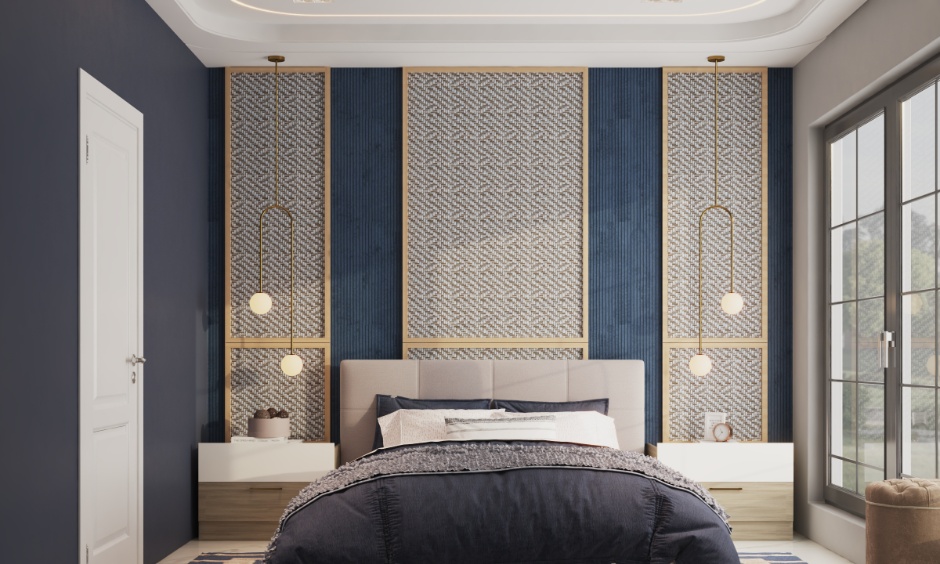
Choosing Warmer, Lighter Neutral Tones in Your POP Design Colour Combination
Neutral shades are the safest and smartest choice for home interiors. They pair well with all other colours. But when it comes to neutrals, most homeowners get confused about choosing the right one because not all are created equal. The trick is to look at undertones – some lean toward warm (think beige with hints of yellow or red or primrose), while others feel cooler (like silver grey, sage green, ivory, etc).
Warm neutrals gently brighten a room with low natural light without making it feel clinical. They pair exceptionally well with warm accent lighting. For instance, an ivory base with a soft cream or beige POP design colour combination adds depth without reducing brightness. This approach is especially useful if you want a timeless look.
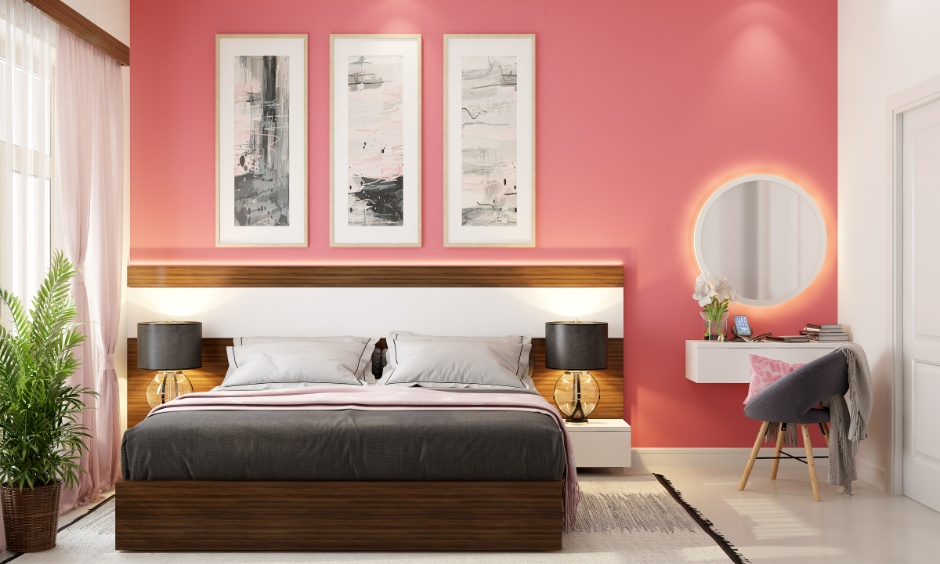
Strategic Use of Accent Walls With Bright Colours in POP and Wall Colour Combination
For low-light homes, use deep saturated colours sparingly as accents. Balance is important: paint 60% of the room in a neutral colour, and use a bright colour on the POP design’s borders or raised sections to lift the design.
Alternatively, you can use a bright colour for the tray section of your POP ceiling colour combination. It adds interest without making the ceiling heavy. Bright colours should support light shades, not replace them.
Common POP Colour Combination Trick: Avoid Dark and Cool Colour Pitfalls
Dark POP colours may look luxurious in showrooms and catalogues. In homes with limited natural light, dark shades like charcoal grey, navy, and dark brown visually lower the ceiling, making spaces feel cramped. This is why such colours are best avoided for the main roof pop colour combination in low-light homes.
If you like darker tones, limit them to accents—just 10% alongside a light POP colour. This captures the richness of dark shades without sacrificing brightness.
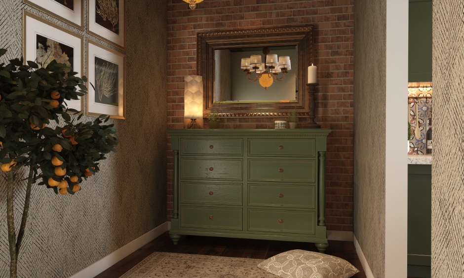
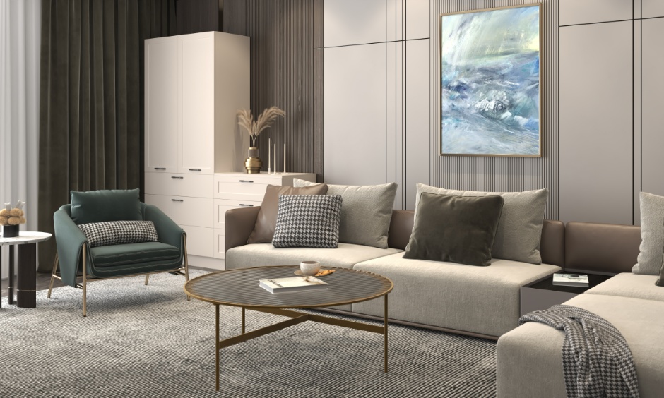
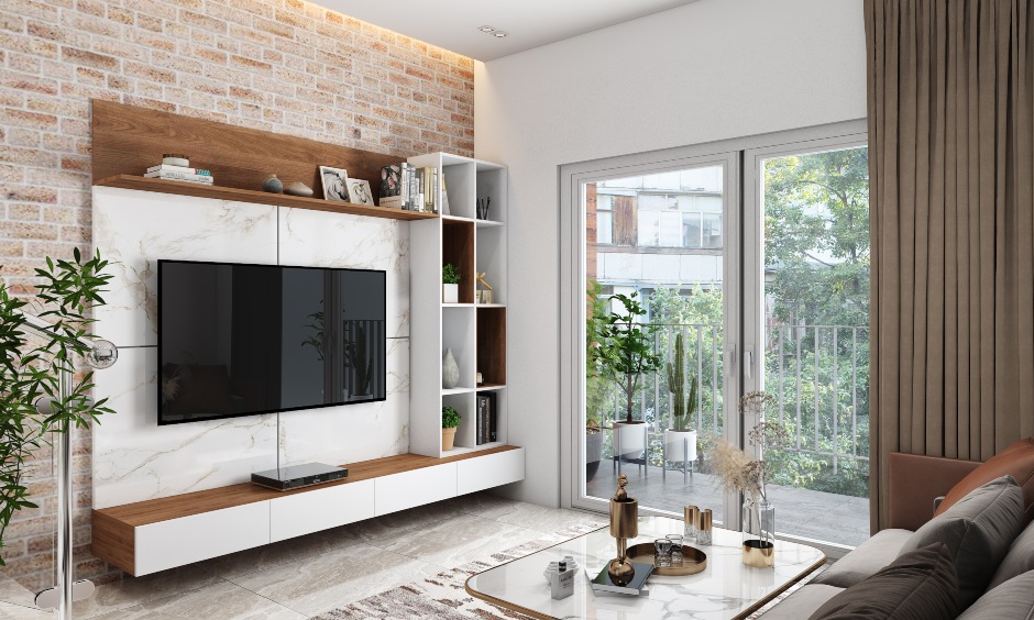
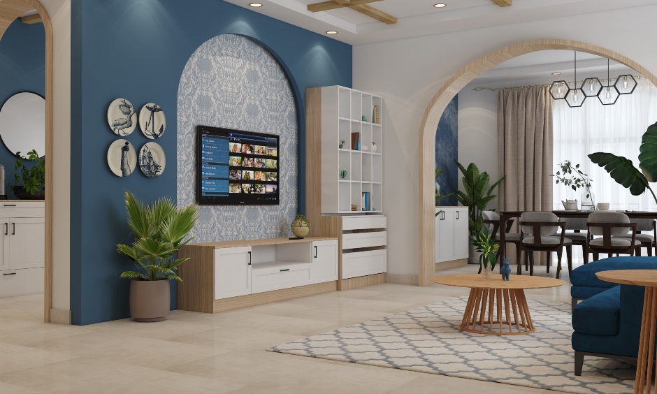
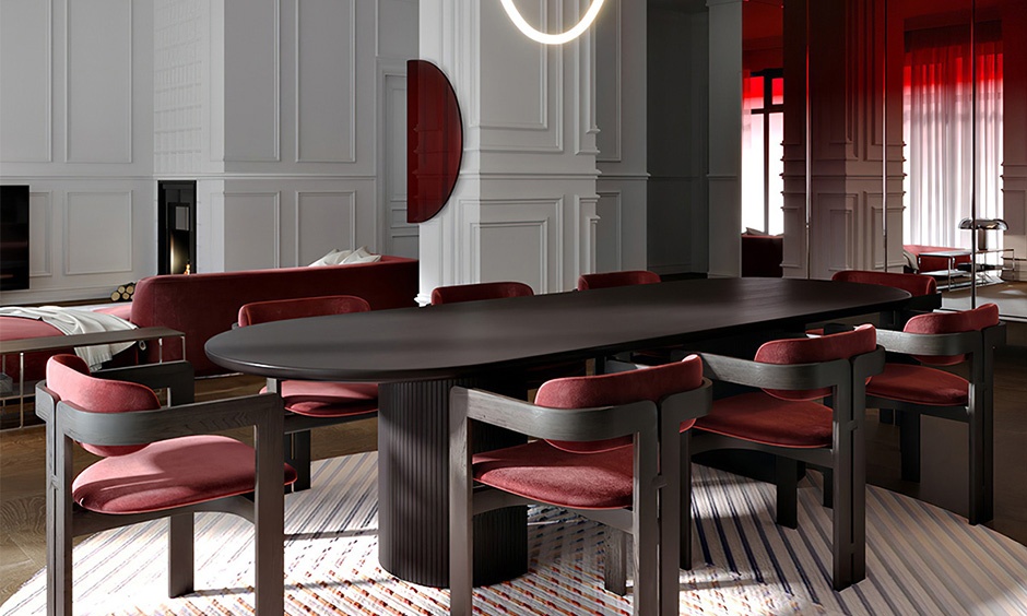
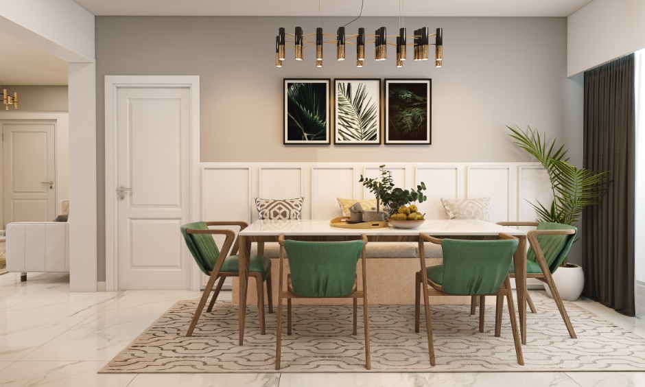
Modern Living Room Interior Designs


Coordinating Colours With Natural and Artificial Light in POP Design Colour Combination
Light plays a major role in how paint comes to life. The same shade can look warm during the day and dull at night if the room direction isn’t considered and the lighting isn’t planned right. Before finalising any POP ceiling colour combination or a POP-and-wall colour combination, it’s important to understand how light behaves in different rooms.
- North-Facing Rooms – These rooms receive very little direct sunlight and feel cooler and darker throughout the day. Here, opt for warm colours like cream or off-white and pair them with warm LED lighting to prevent the space from feeling dull.
- East- and West-Facing Rooms – These rooms experience changing light through the day, which can alter how POP colours appear at different times. Balanced light POP shades, such as warm white or pale beige, work best here, paired with neutral or warm lighting to maintain consistent brightness.
- South-Facing Rooms – South-facing rooms receive strong natural light, making them brighter for most of the day. Use neutral or slightly cool POP colours like soft white or alabaster with a hint of grey, along with soft white lighting, to avoid the space looking too yellow or harsh.
Why is Testing the POP Design Colours Combination a Non-Negotiable?
Skipping colour testing is one of the biggest mistakes homeowners make. POP surfaces behave differently from walls, and ceiling light exposure changes throughout the day.Always test your chosen colour on a small patch of the ceiling. Observe it in morning light, evening light, and under night bulbs. This small step can help you avoid expensive repainting later. It is especially important for a POP colour combination for bedroom, where comfort matters most.


Matte or Glossy: Which POP Colour Combination Finish is Better for Low-Light homes?
Finish matters as much as shade and light. In low-light homes, soft-sheen finishes are usually safer. They distribute light evenly and hide minor surface flaws.
While glossy finishes reflect more light, they also highlight cracks. Unless the POP work is extremely smooth and the room has good lighting, glossy finishes can look patchy over time.
For most Indian homes, a matte ceiling pop colour combination offers long-term peace of mind.
Enhancing POP Design Colour Combination With Complementary Decor
POP colours don’t work alone. In the 60-30-10 colour theory rule, 10% is dedicated to the accent colour. It can be added by the choice of curtains, soft furnishings, decor pieces, and more. For instance, light-coloured curtains, reflective surfaces like mirrors, and neutral fans help bounce light back onto the ceiling, making even simple POP colour combinations look brighter and more balanced.
In a nutshell, colour selection doesn’t have to be stressful. With these POP colour selection tips, you now know how to choose shades that brighten your home, avoid common mistakes, and feel confident in your decisions—even without design expertise.
Want more inspiration? Explore our blog section for room-specific POP colour ideas and real Indian homes. Need personalised help? Book a consultation and get expert guidance tailored to your home’s light, layout, and budget. Your home should feel comforting the moment you walk in—and with the right POP colours, it absolutely will.
FAQs
1. What is the best colour for a dark room in India?
Light, warm colours like off-white, cream, soft beige, or light peach work best for dark rooms, as they reflect light and make the space feel brighter and more comfortable.
2. Should I use dark colours on the ceiling?
It’s best to avoid dark colours on ceilings in low-light homes because they absorb light, making the ceiling feel lower and heavier.
3. How does lighting affect POP wall colour?
Lighting changes how POP colours appear; warm lights enhance cream and beige shades, while cool lights suit pure white POP designs, and poor lighting can make colours look dull.
4. Are matte finishes better than glossy for low-light rooms?
Yes, matte finishes are better because they spread light evenly and hide imperfections, while glossy finishes can reflect light harshly and show flaws.
5. Can I use bold colours in a room with little natural light?
Yes, but only in small areas like borders or accents, and always balance them with light base colours to maintain brightness.